April2017

A Bit of "Backward Design"!

I've discovered a new design technique ...  well at least a name for it!! 

I was browsing through on of my favorite textile art books "Stitch Stories"  by Cas Holmes and in a section on collage she talks about a process she calls 'backward design' .....  extracting compositions from a larger design .....  and that's just what I've been doing this week. 

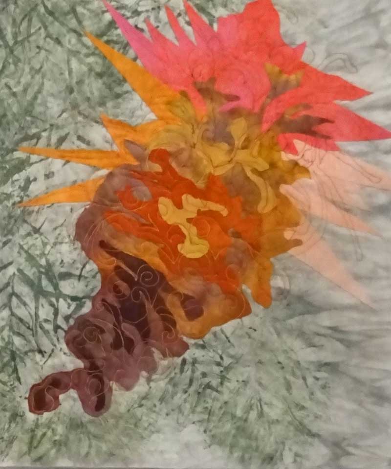
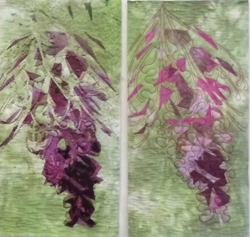
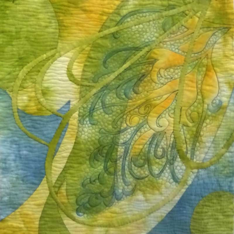
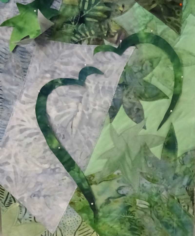
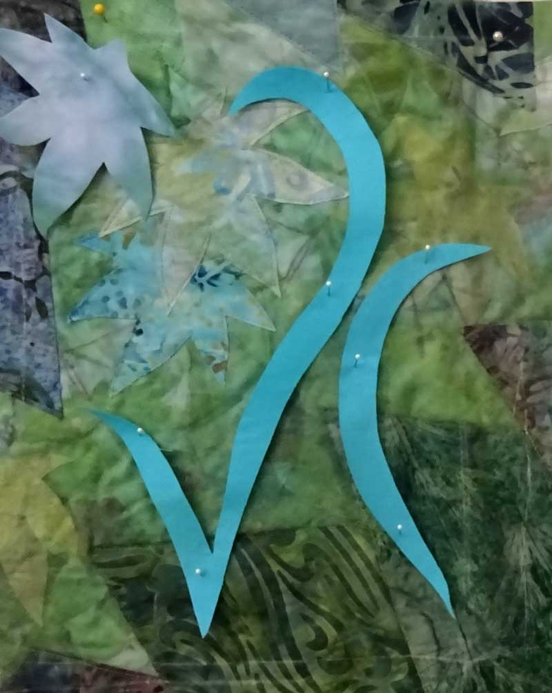
I had a larger piece that I made a year or so ago and although there was a lot I liked about it,  something was missing so I set it aside (.... waiting for inspiration !) 

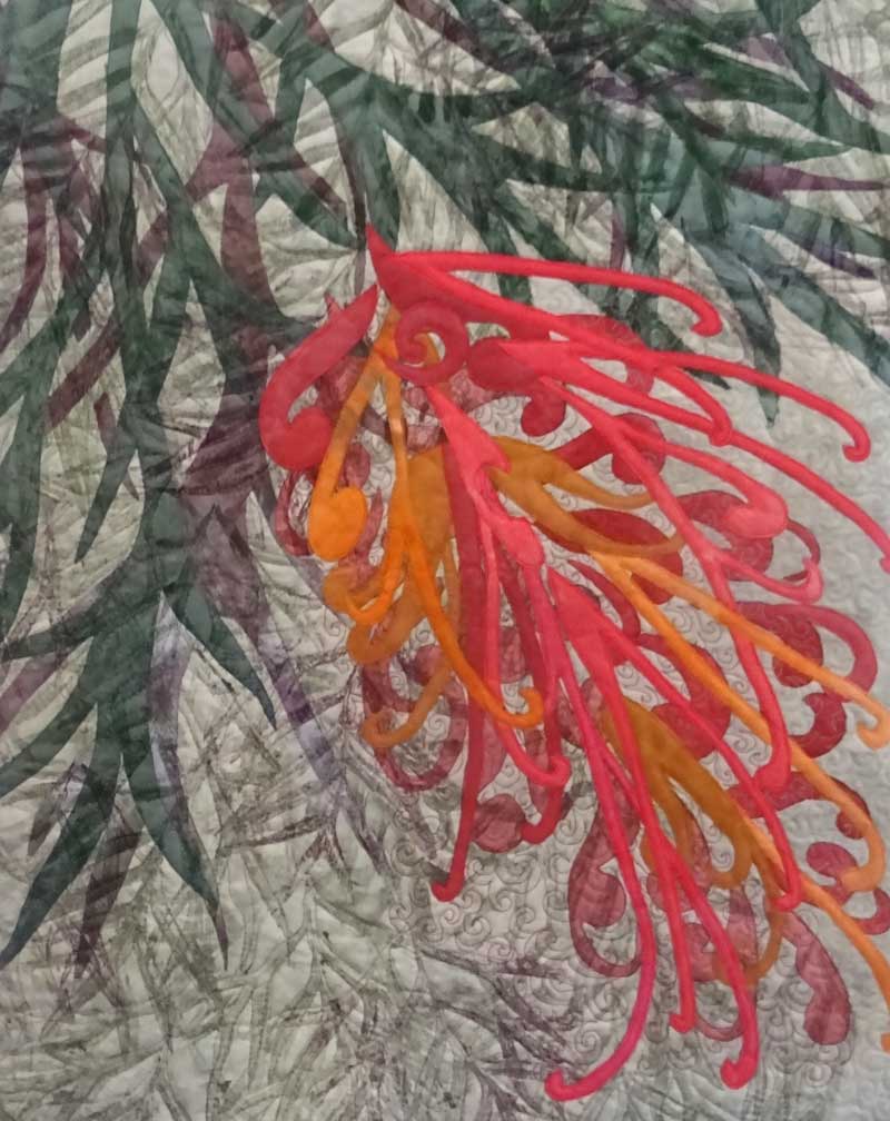
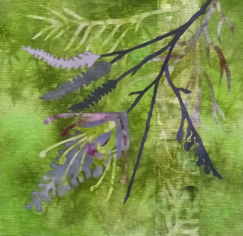
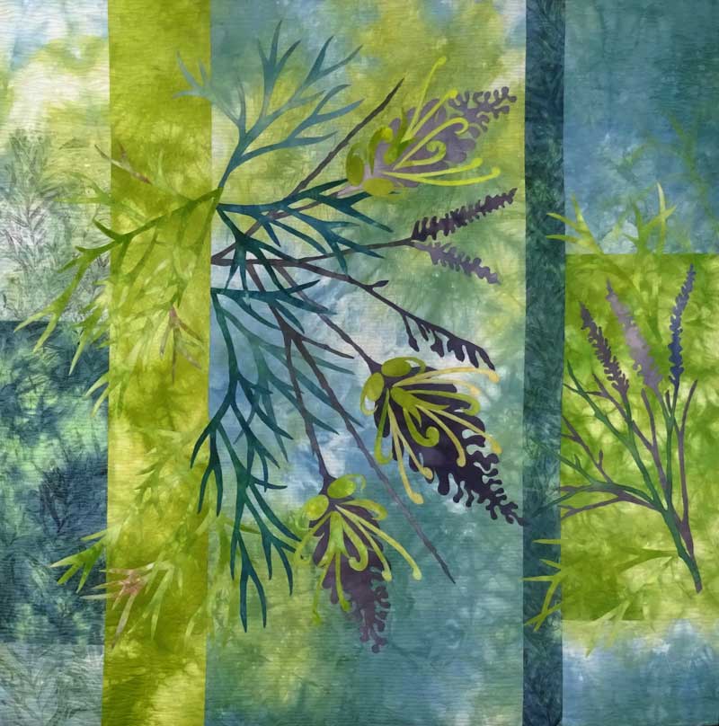
Inspiration came in the form of an idea from an old sketchbook .... putting the two together meant cutting sections from the larger piece as the basis for the new compositions.

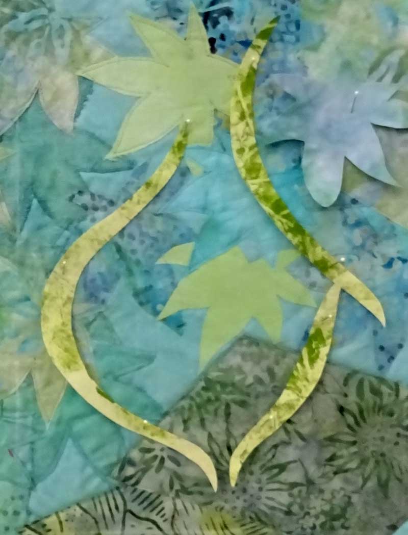
 The result is a series of new leafline pieces on the design wall ready for stitching .....  here are three of them .....

I think this will be a very useful design technique for the future   ..... 

And I can highly recommend ............"Stitch Stories" by Cas Holmes,  Batsford, London 2015    if your are looking for inspiration !! 

Have you tried some 'backward design' ??      Thanks for reading ............CC  


New WindingWay Landscape

This new piece has been reworked a few times .... I was pretty happy with the landscape background but struggled to find a fabric for the overlay.  In addition,  this piece at 16" x 16"  is larger than the previous works in this series so that added an extra challenge for the composition!!

                                 'Winding Way in Pink'  © CarolynCollinsArt 2017  16" x 16"

                                 'Winding Way in Pink'  © CarolynCollinsArt 2017  16" x 16"

The larger size of this piece called for a rethink which resulted in the addition of some new elements ... a more complex landscape background and in this piece a digital image printed on organza which adds  a nice sense of depth.  

I thought it would be interesting to look at the development of this series to date ... starting with the first compositions at the bottom left   ......

The next step is to develop and refine  this larger design .......

Thanks for reading ...........  CC

Grevillea's in Review

My Grevillea Series has been rolling along for a while now and before I launch into Number 10, I thought it would be a good idea to review  progress.  Looking back and seeing the work all together is helpful with new directions and new ideas ... not to mention that it makes me get my photo files into order and update my art database!!

So here they are in sequence of construction .....

The first piece turned out to be a disaster from a technical point of view!  The issue related to layering fabric over the printed organza making for a very unstable piece when it came to the stitching!!!  However I like the color and design ideas and this piece remains on my design wall for inspiration.

After that experience,  I stuck to applique and reverse applique (with no fancy fabrics)  with a good result and second grevillea is part of the SAQA 2017 Trunk Show.  

In the Pink Grevillea piece I was determined to master the organza, because I really like the effect of printing on it,  and tried a variety of  flower shapes. This was a good learning experience but it lacks something from a design perspective!

In the middle row ...  the stylised fower design and development of the backgrounds by incorporating hand printed fabric has worked well and I am really pleased with these.  Peaches and Cream was part of an exhibition at Kangaroo Valley and now hangs in a new home!  

Recently I have been exploring a more abstracted flower design in the pink/purple pieces and have returned to the original idea of stitching the flower design ....... with much more success!

The final two pieces use the backgounds I made a couple of weeks ago,  now stitched and appliqued.  I think the blue/green/yellow piece is the most successful.

While I contemplate what next,  I would love to know which grevillea you like best??

Thanks for reading .....  CC

Art Date with "The You Beaut Country"

Had the opportunity this week to spend a couple of hours at the Art Gallery of NSW to see the John Olsen Exhibition "The You Beaut Country" an experience I can totally recommend!!

This exhibition provides a wonderful survey of John Olsen's career from his first exhibition in 1955 to his recent works and includes commissioned ceiling paintings, tapestries and decorated ceramics.

John Olsen's work has a very distinctive and personal style that definitely captures the uniqueness and energy of the Australian landscape.

I came away delighted with joyous use of yellow,  the expressive connecting lines and the way he combines a wide overview of the  landscape  with the minute detail of it's components like  fish, plants, insects ......

I love the yellows  in works such as 'Sydney Sun'  and 'Summer in the You Beaut Country'  and  'Seafood Paella'  below ... on the cover of the catalogue ... another terrific exhibition publication which I have added to my collection.

The use of expressive line is another outstanding feature of his work that is captivating.. it is sometimes bold and exuberant ... sometimes fine and delicate  .... sometimes dominating the work .... sometimes providing intricate detail at the edges of the work.    It seems to me that this is in  part how he captures the vastness of the Australian terrain as well as the character of the specific environment.  There is so much to discover and enjoy  in these paintings.

The exhibition also includes tapestries, decorated ceramics and some of the many journals he maintained over 5 decades.  These include his writings, sketches, photographs and ephemera - tickets, postcards, bird feathers! and provide a glimpse into the artists world.

The exhibition runs until June 12 at the Art Gallery of NSW.

Have you seen the exhibition?  What was your reaction?

Thanks for dropping by .....CC