Carolyn Collins Art

Searching for Glow ...

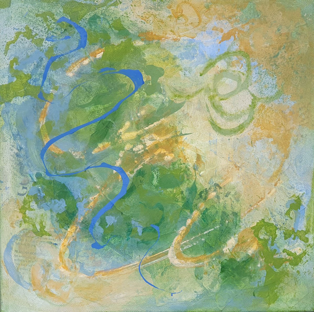
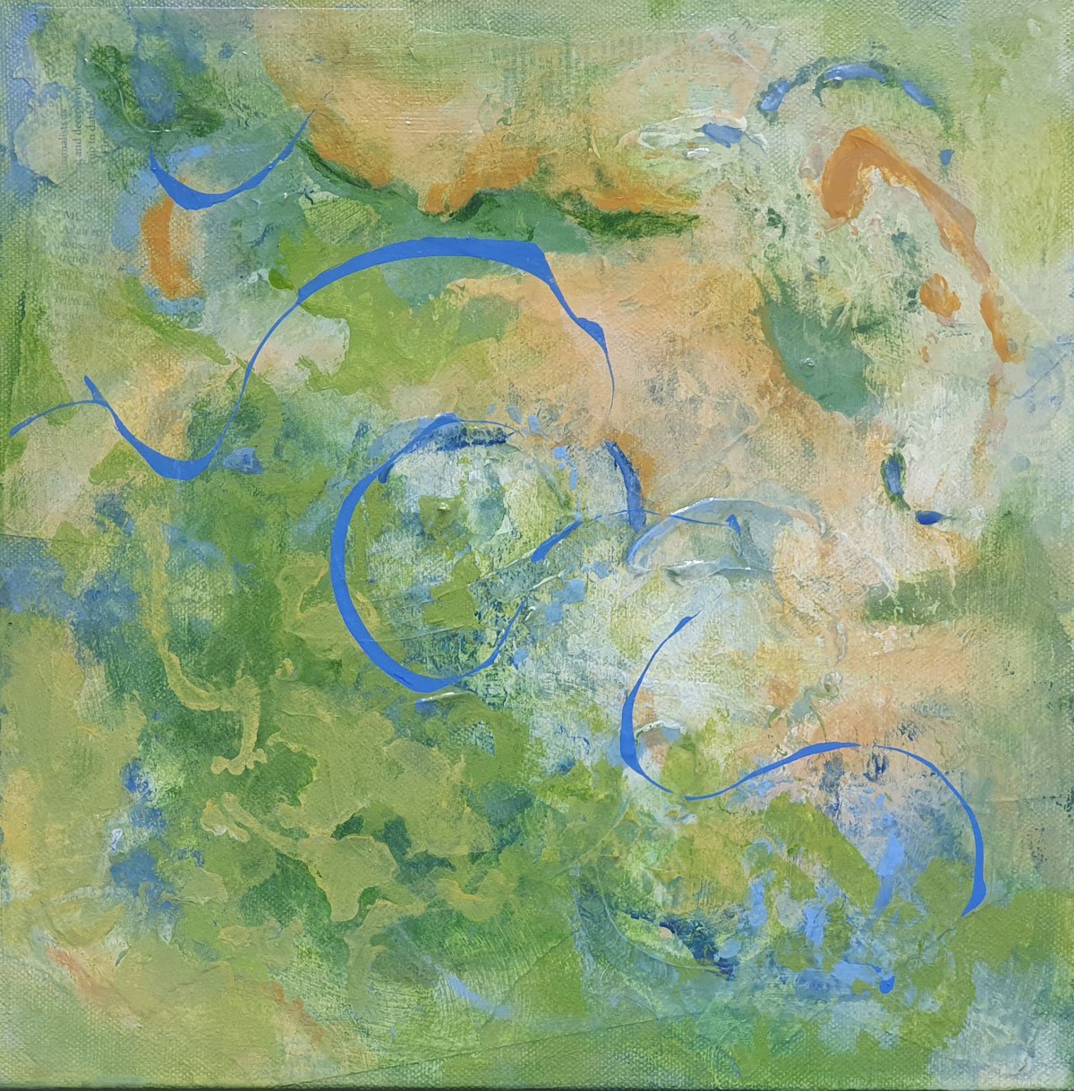
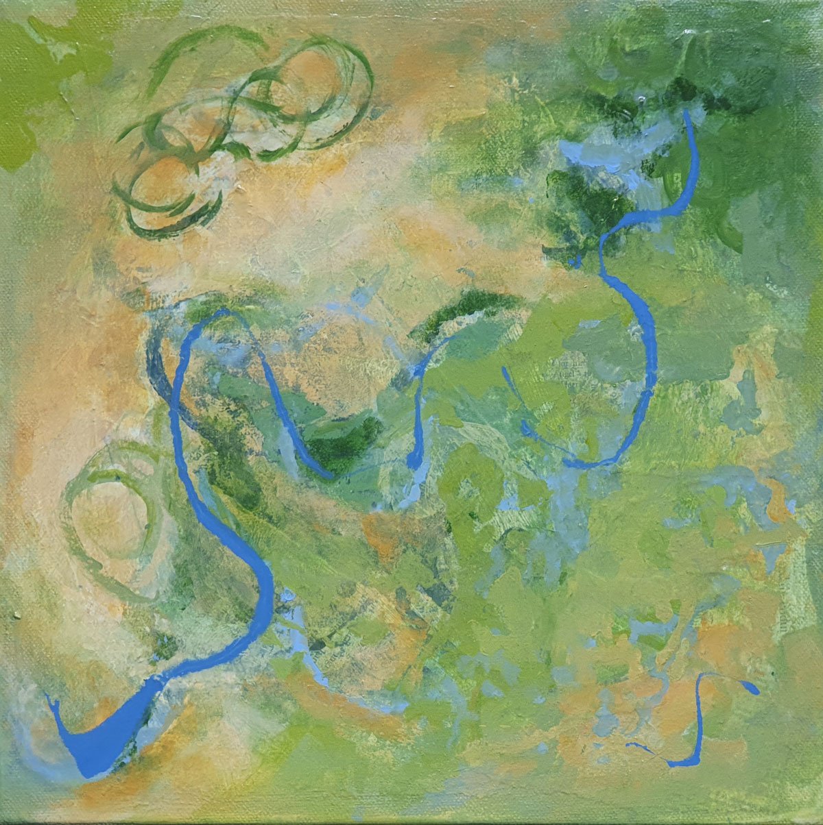
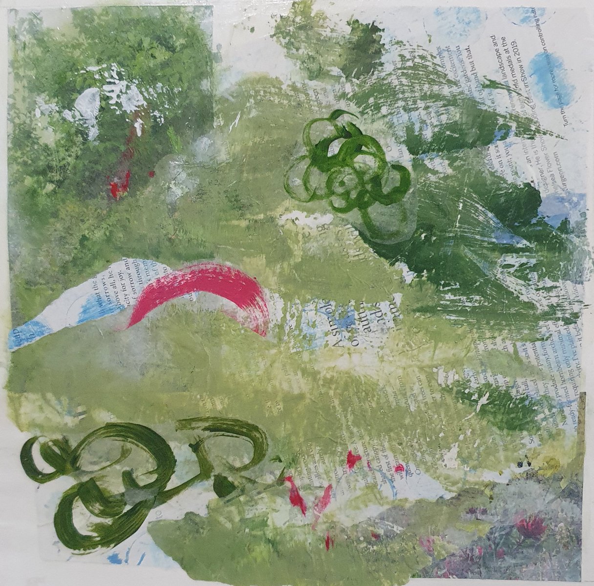
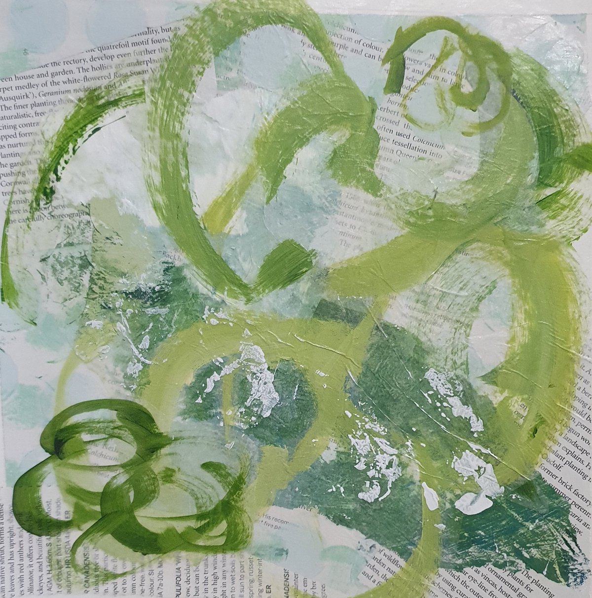
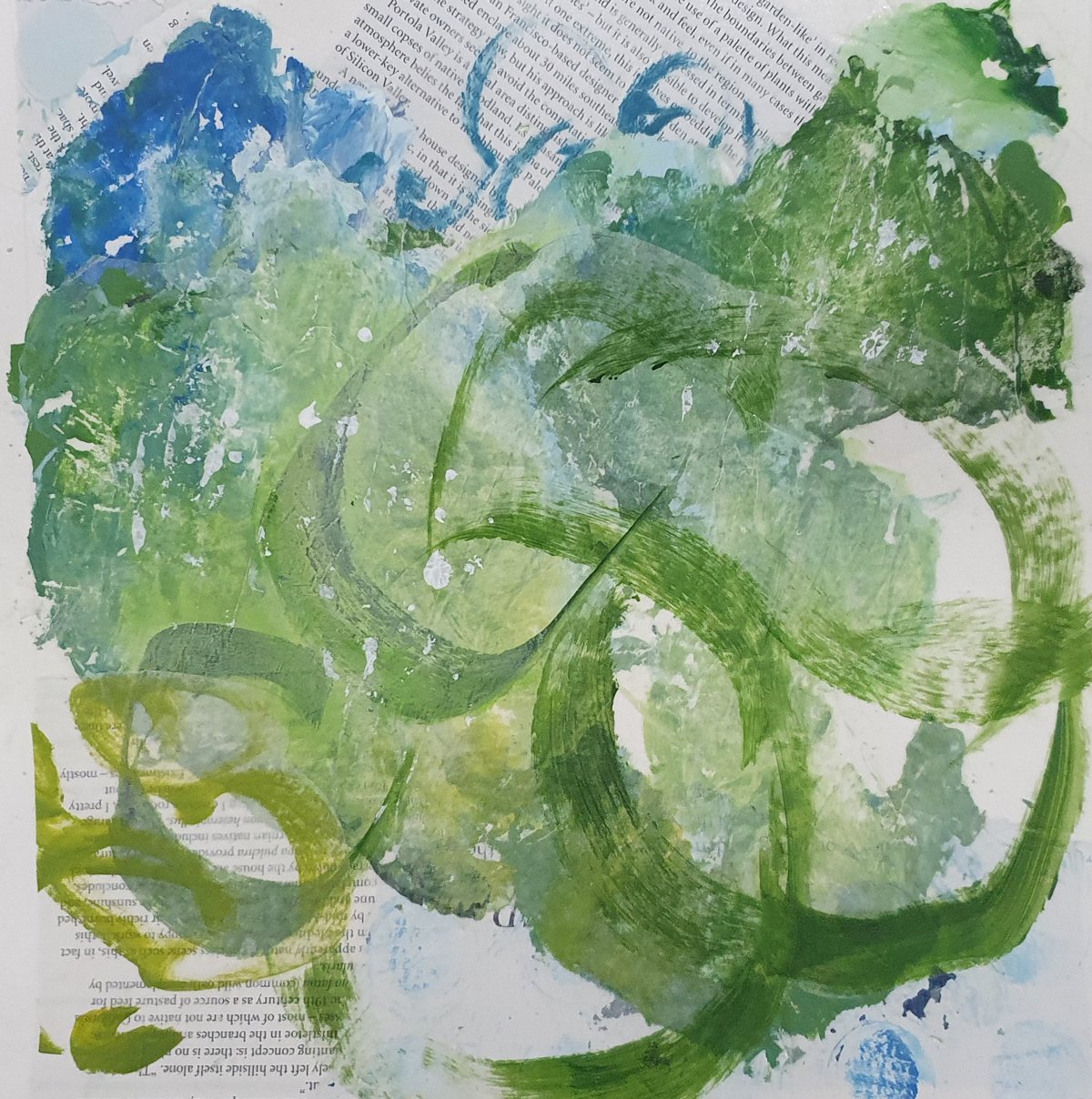
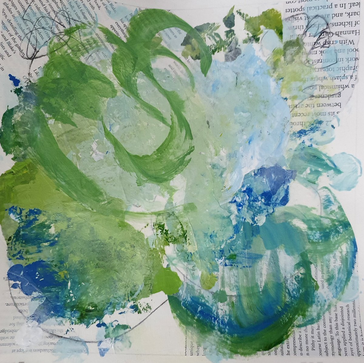
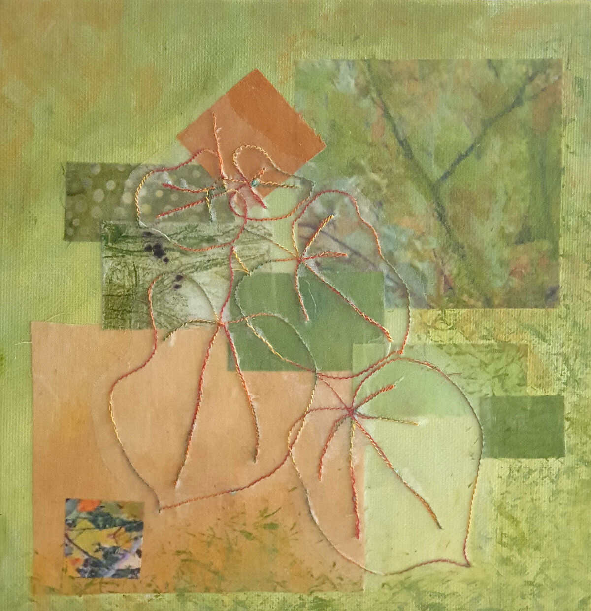
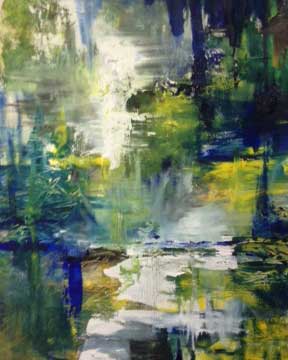
Earlier this year I was working on a group of 12 inch square canvases using a palette of greens and some golds.

One of the things I particularly like about these pieces were the areas that appeared to glow … a golden light.

I find I am particularly drawn to that sense of ‘glow’ in the natural world … a beautiful sunrise or sunset for example and something that is very pleasing when I find it in my painting!

So what does colour theory have to say about ‘glow’ …

David Hornung in his excellent book “Colour: A workshop for Artists and Designers” talks about inherent light …. “ the sensation of light emanating from within a colour … the experience of inherent light seems to be a psychological response. It can best be described as an inner glow that a colour seems to have in relation to other colours.”

David Hornung goes on to explain that this ‘inner glow’ is related to a colours saturation ie a muted colour might glow when seen with duller colours and inherent light seems most pronounced when colours are close in value and disparate in temperature.

Having gained this knowledge the challenge is to put it into practice in my painting!

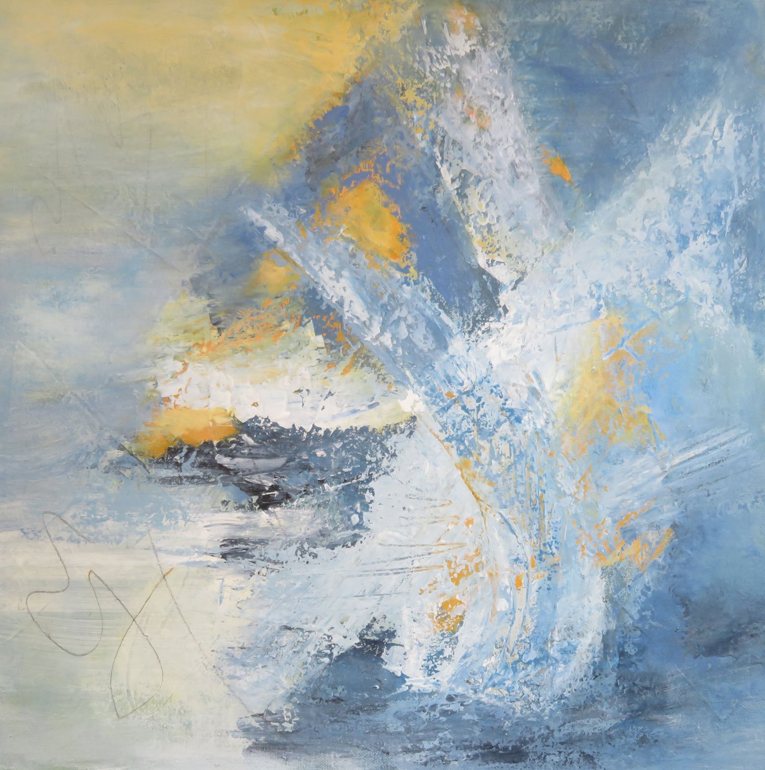
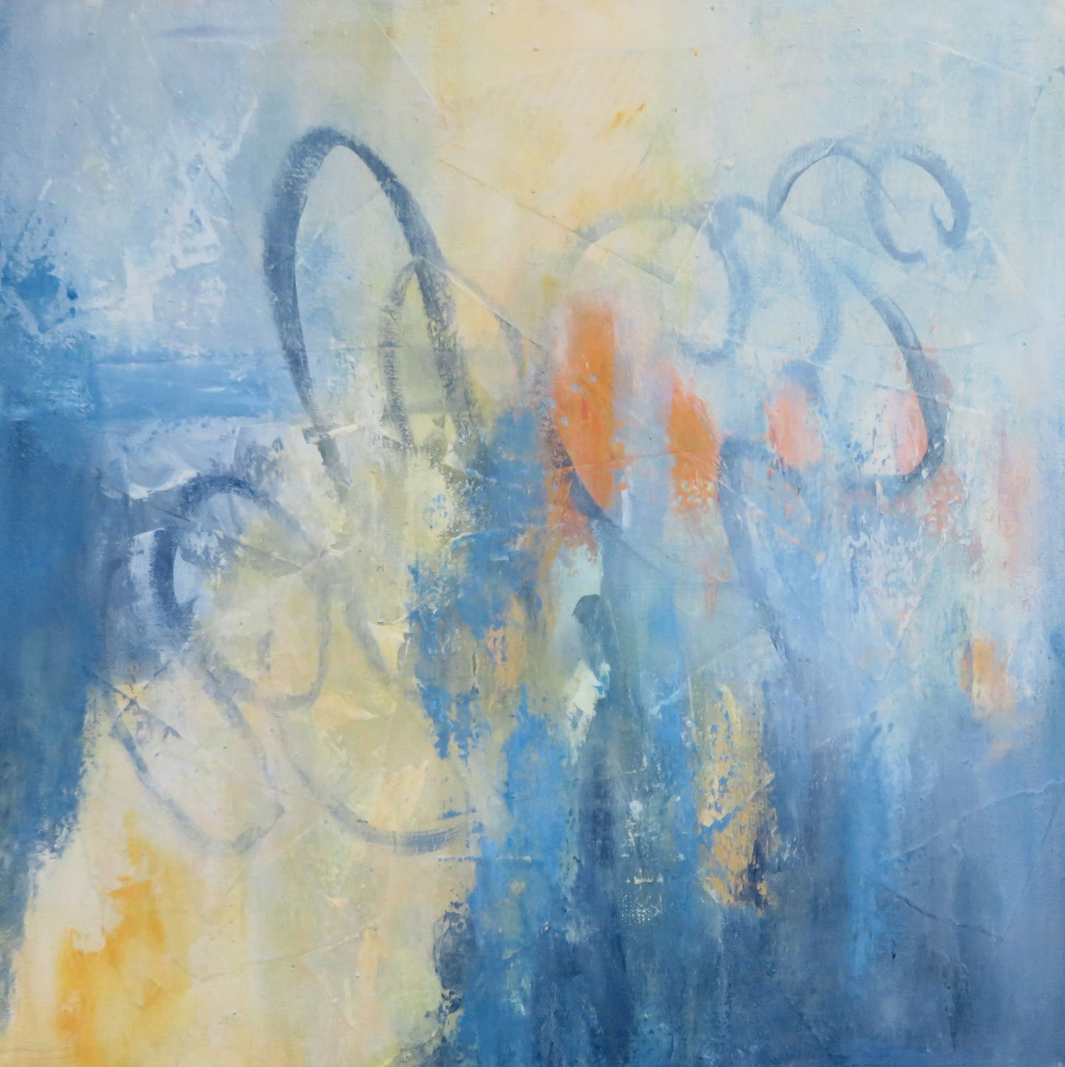
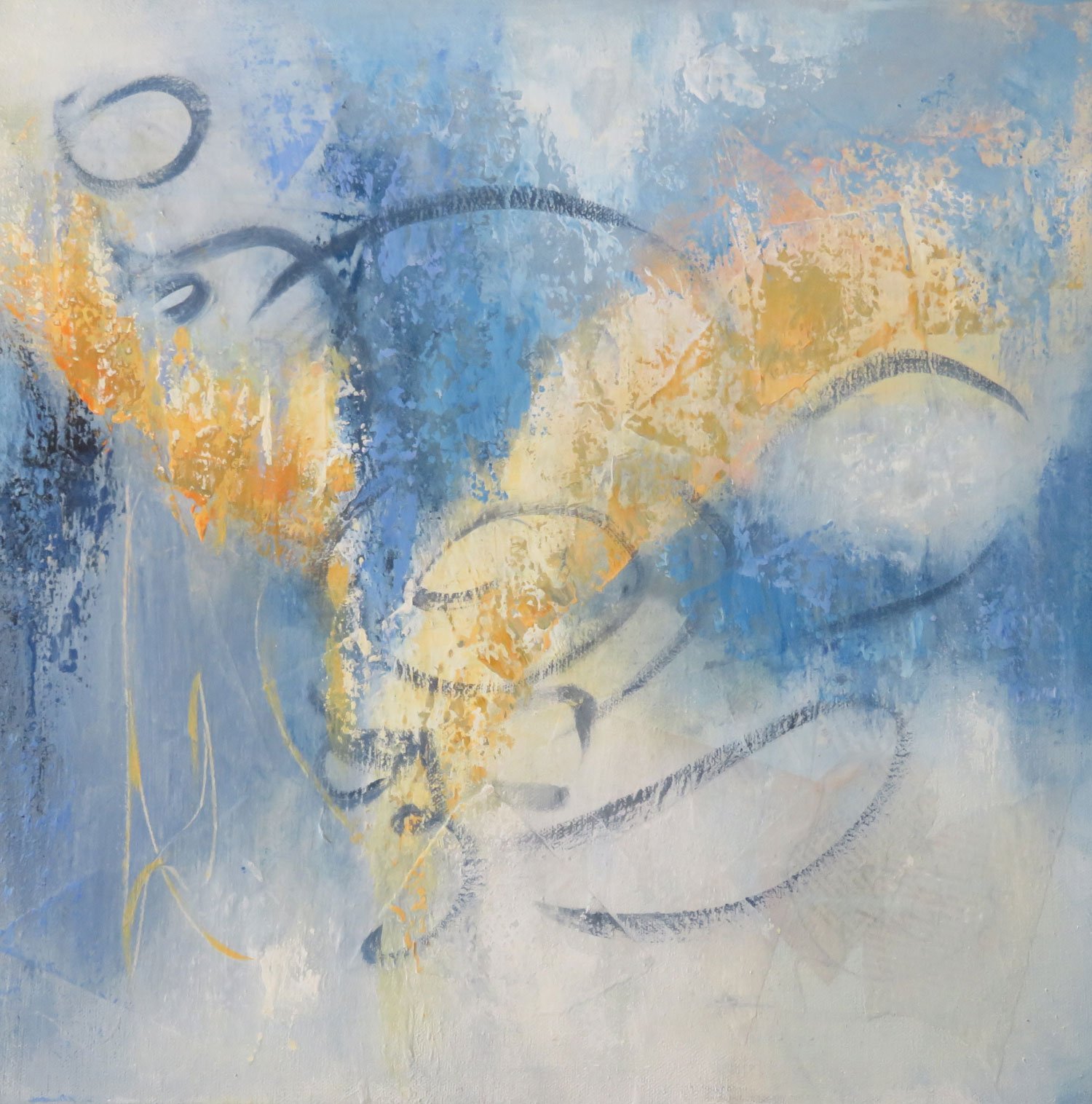
Over recent weeks I have been working on a series of 18ins square stretched canvases using a palette of blues and Australian sienna. I’m still contemplating these before I call them done ….

For me these works are intended to capture the energy of the morning …. going out into the garden with my ginger cat, to greet the morning and the promise of the new day!

Faced with a long lasting wet weather pattern here on the south coast of Australia, trying to find that glow in my paintings has taken on even more significance … I am craving some sunshine!

Thank you for reading and taking an interest in my art …. CC


Always

Text and Lyrics ...

For the last couple of days there has been a song stuck in my head and almost on constant replay!

It’s a song from the movie ‘Babe’ … not sure if its the words or the melody that grabs me - it goes

“If I had the words to make a day for you, I’d sing you a morning golden and new”

I’ve also recently become aware that words and writing are more important to me than I had realised and are closely associated with the ‘why’ of my art and its content.

In a past life, writing reports, presentations and speeches was a big part of my job, but not so much in recent years … except for this journal which I started in March 2016 and which surprisingly includes 88 posts!

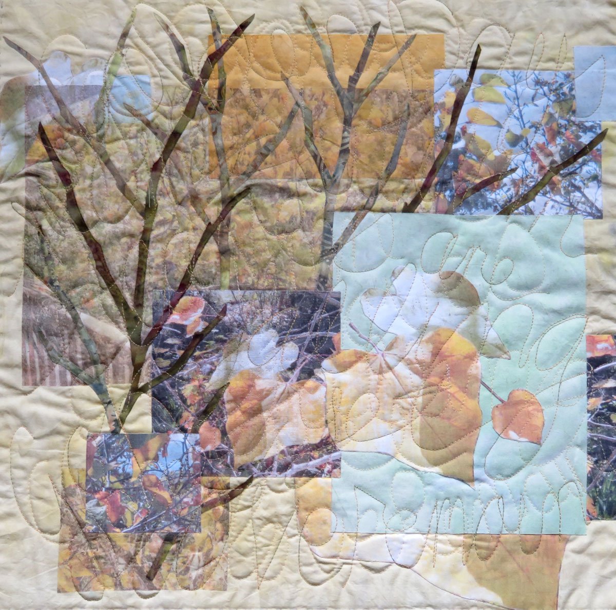
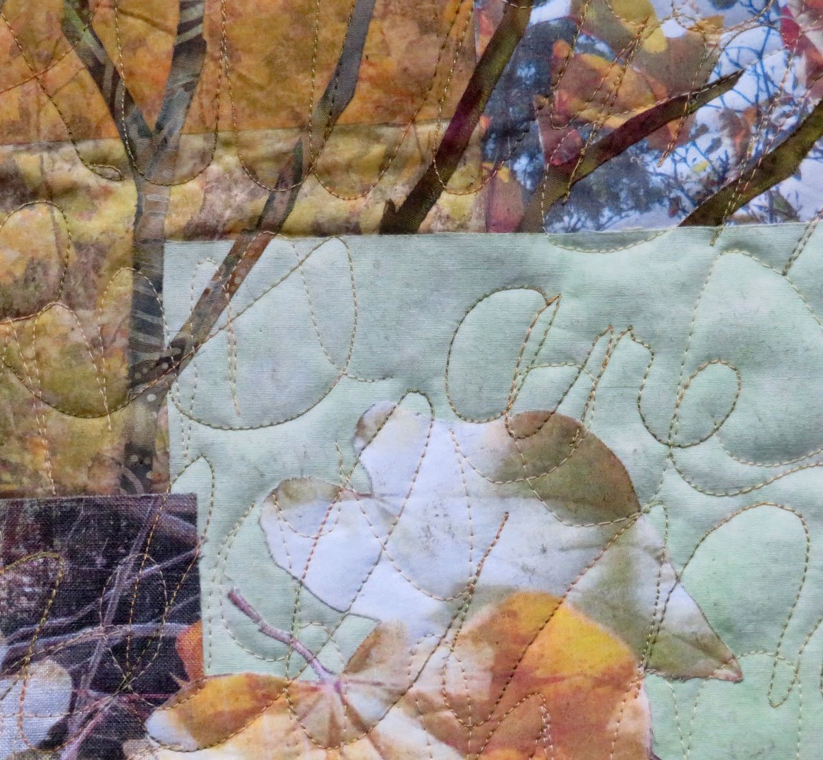
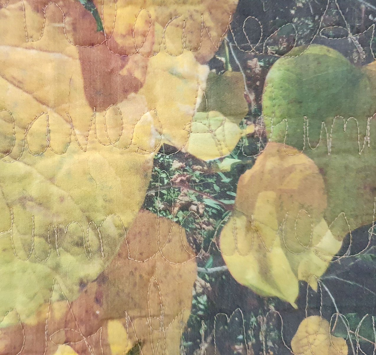
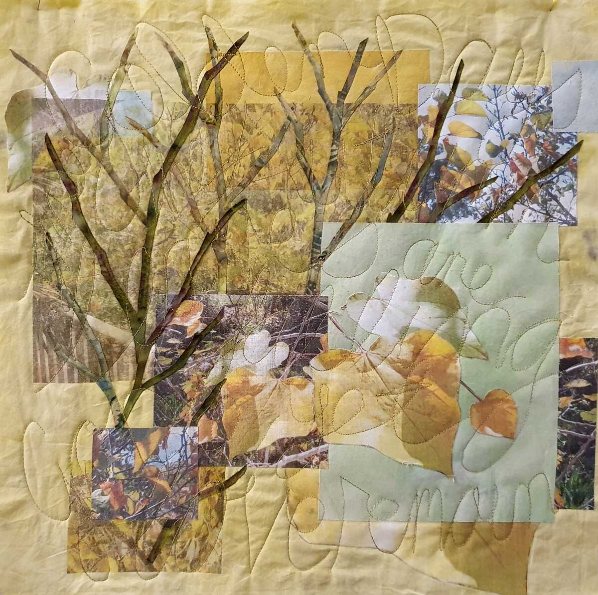
Words first started to appear in my art in 2019 when I stitched some haiku , written specially, as a quilting design on some works made with photographs on fabric ….

With the move to collage and paint in 2021, the opportunities to incorporate words and writing into my art expanded.

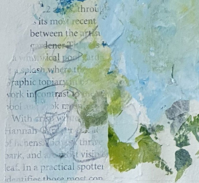
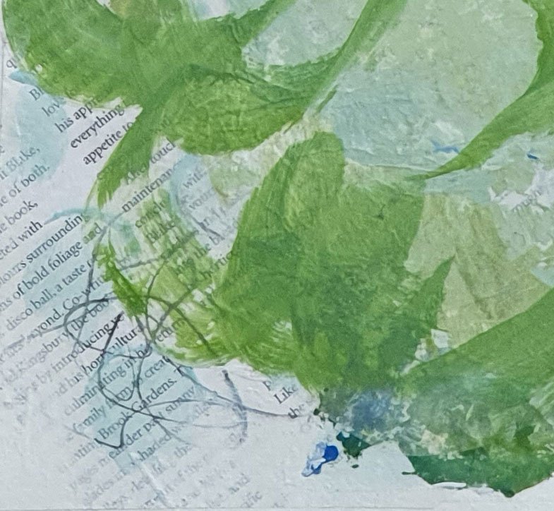
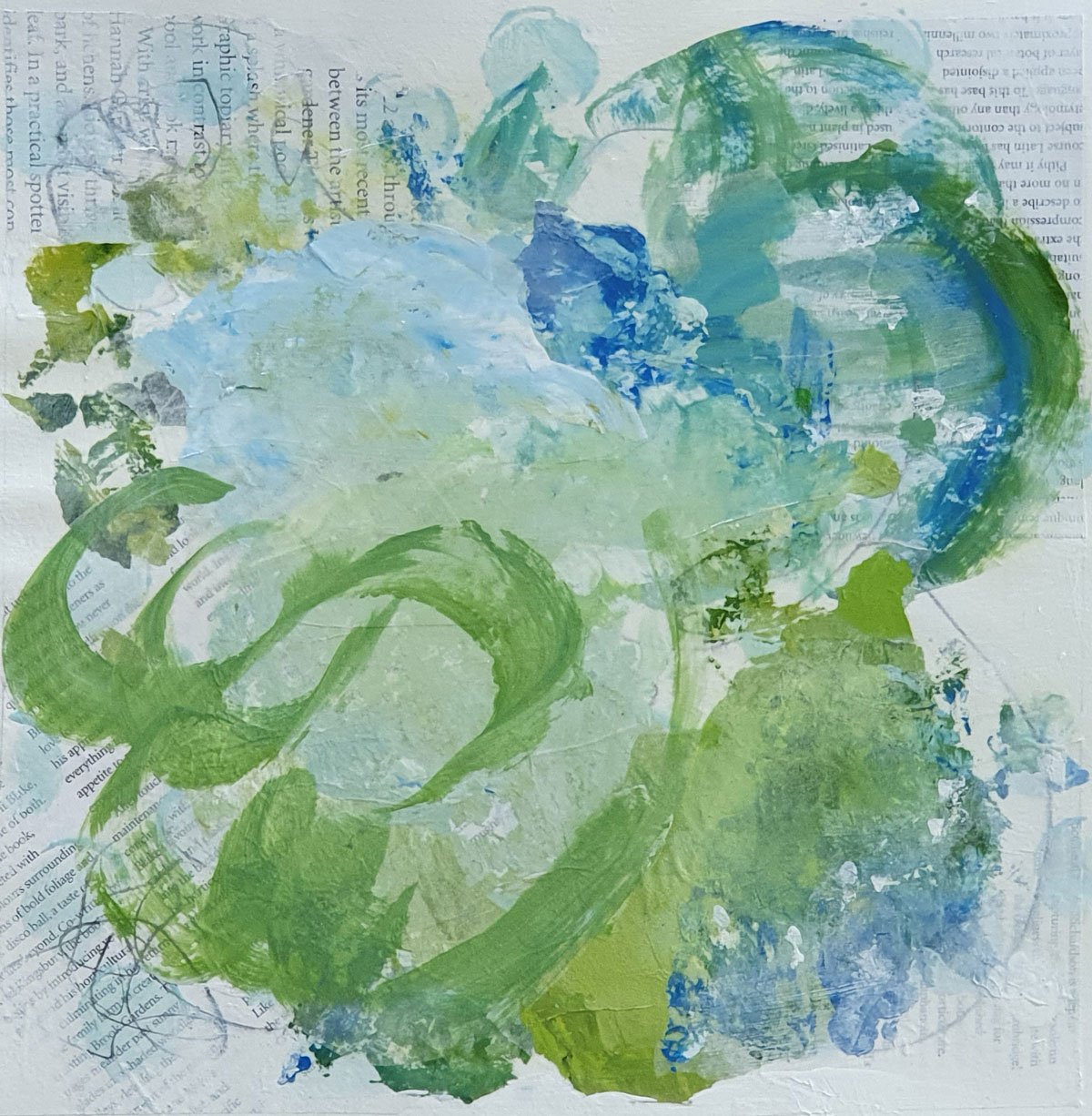
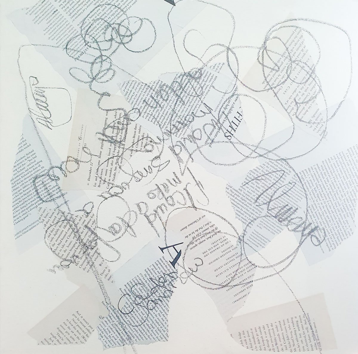
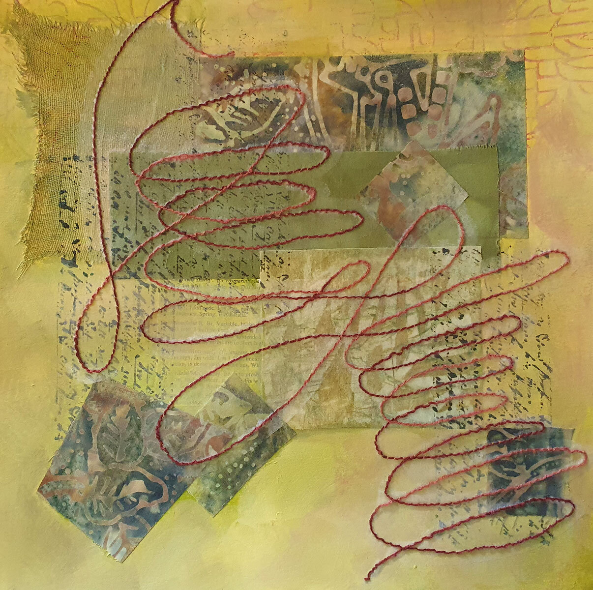
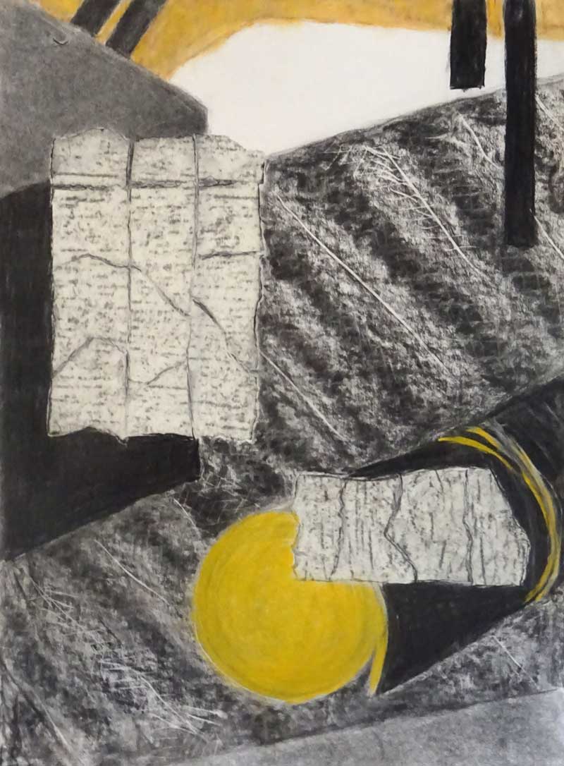
It began with using text in the form of magazine and book pages as collage materials… my process is to build up the early layers with collage text, mark making and writing, building the story as I go.

The writing …. words, haiku, song lyrics …. hand written thoughts and feelings becomes the heart of the story, although mostly covered by paint or new collage layers some areas remain partly visible, not to be read but to create an energy and sometimes texture, that underlies the work.

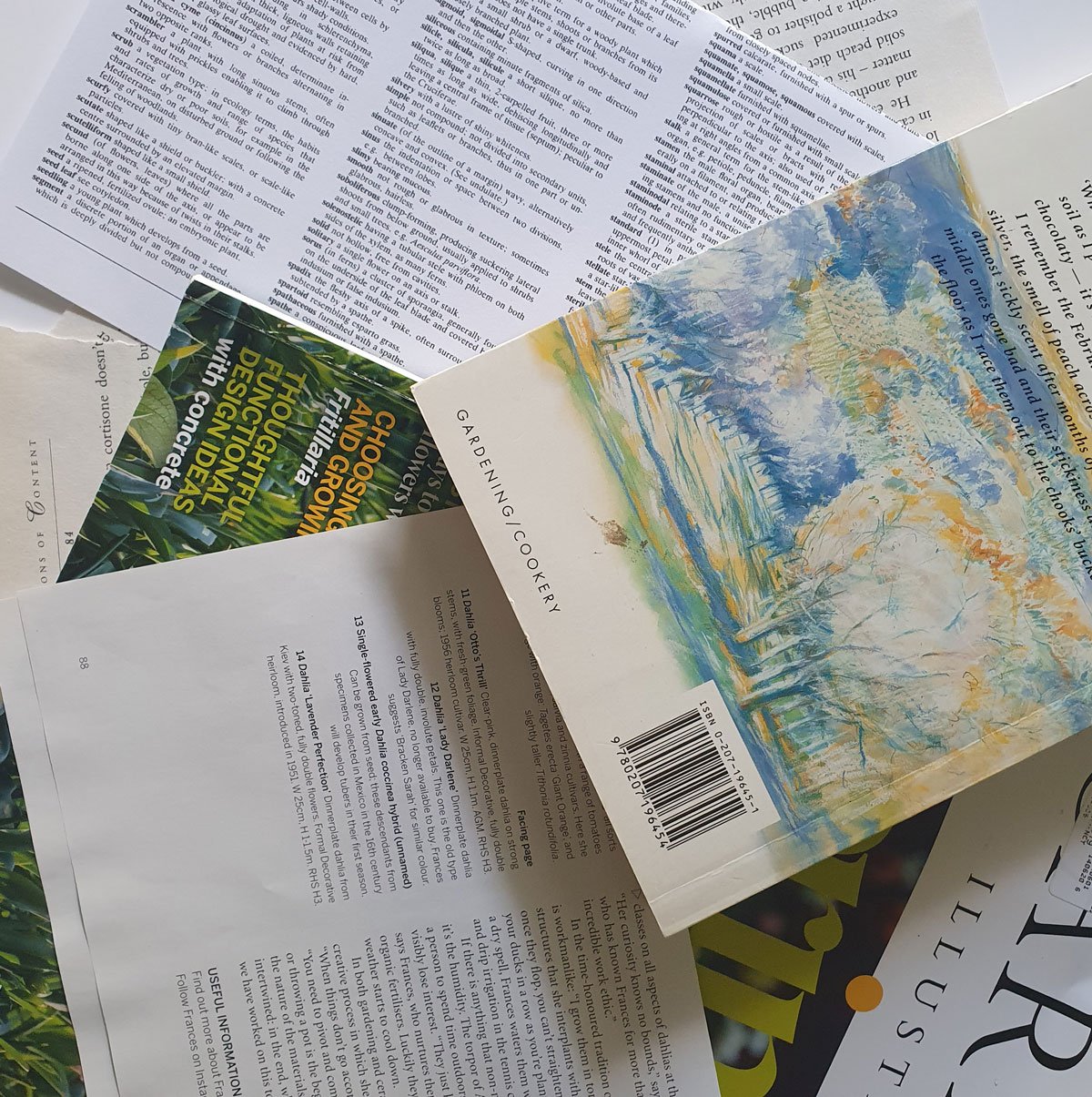
Old paperback books and references like ‘Seasons of Content’ and Dictionary of Gardening and text from old copies of my favourite magazine Gardens Illustrated have all found a place in my ‘Songs from the Garden’ series. I’ve written quotes, lines of poetry and my own haiku occasionally too.

All these elements help me to give meaning to the work and to shape the final piece.

When it comes to the two canvasses I’m just starting to work on, the writing includes the songs lyrics that have been stuck in my head …..

Let’s see what evolves from here !

Thank you for reading, I appreciate your interest in my art. CC

Always
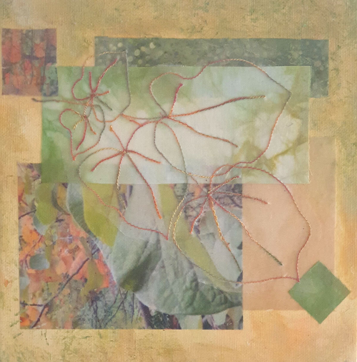
Symphony ......

Starting out on a new series with a mixture of paint and collage, I set some parameters for the series in terms of size, colour palette and mix of substrates etc.

And yet it felt a bit overwhelming with all I had learned in the change to working with paint and collage and the many ways of putting it all together!

While I was contemplating getting started and perhaps procrastinating a little bit! …… Daniel Pink’s book , ‘A Whole New Mind’ crossed my path. This is not a new book, it was published in 2008. It’s main premise is that the future belongs to right brain thinkers and outlines 6 fundamental elements that will be essential to professional success and personal fulfilment.

What was most interesting to me was the concept of ‘symphony’ . It is the idea of seeing the connections between diverse and seemingly separate elements and putting them together to create something new by working across boundaries, by inventing new combinations or by understanding one thing in terms of something else ie using metaphor. In other words the work of the artist!

Daniel Pink has lots of suggestions for developing this skill of symphony, for example:-

- listen to the great symphonies,

- follow the links ie “choose a topic you find interesting and type it into a search engine and follow one of the links. From this initial site select one of its links and venture on’

- keep a metaphor log writing down compelling and surprising metaphors you encounter.

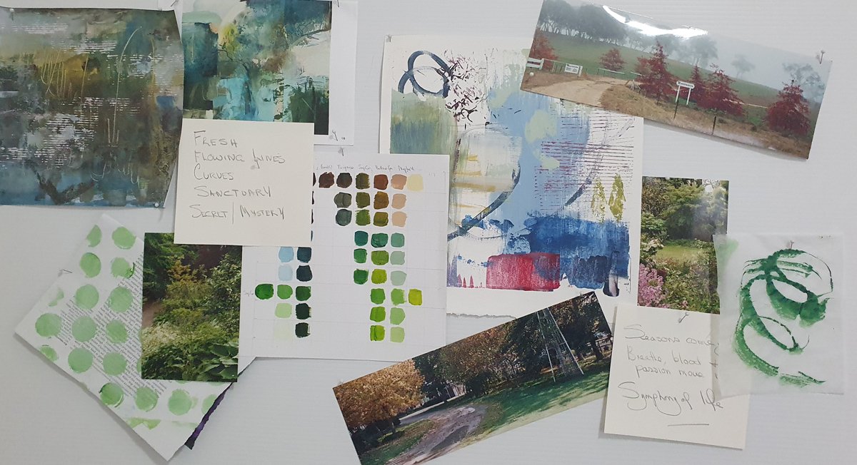
He also suggested creating an inspiration or mood board “each time you see something that you find compelling - a photo, a piece of fabric, the page of a magazine - tack it to the board. Before long you will start to see connections between images that will enliven and expand your work”

So the mood board became a key resource and starting place for the new series and as it continues to develop and change so does the artwork!

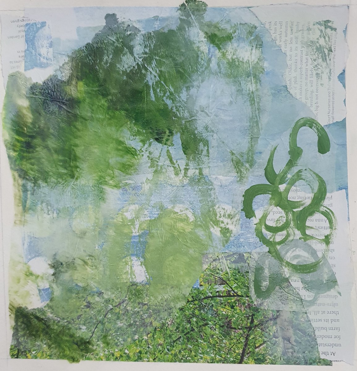
Here is how the series is looking so far …

I am looking forward to seeing how it continues to develop and will definitely be building ‘symphony’ practice and mood/inspiration boards into my ongoing practice and art process.

Thanks for reading …. I appreciate your time and interest. CC


New Adventure!

After all the uncertainty and constraints of the last year or so with COVID, I’ve been looking for something that will ‘light me up’ and give me a new burst of energy!

Late last year I started to explore the world of collage and mixed media, not unrelated to the fused applique techniques of textile art. I moved from using just textiles to working with paint, paper and fabric. Here are a few of my explorations ….

What I’ve discovered is that there is a world of possibilities when paint is added to the mix and much for me to learn and explore!

So I’ve signed up for the Art2Life CVP 2021 course - 12 weeks of exploring the possibilities of acrylic paint and more!

I’m not sure where it will take me and where textiles will fit but I’m excited and looking forward to the journey.

The first couple of weeks have been focussed on what inspires us, what we want our art to be and the Art2Life process. Now we are about to get into the painting! Such fun!

Thank you for reading and taking an interest in my art. I’ll be back soon with and update on my progress!

CC

Experimenting with Leaves and Landscapes

This last week I have been playing with ideas for my Leaf Series,  in part prompted by the drawing class challenge I shared last week (I'll show you how I'm going at the end of this post).

Decided to try combining a simple landscape with one of my favorite leaf designs and to make the leaves using a 2 step reverse applique to give a line effect.  I wasn't altogether satisfied with the result.  I think it would have worked better if I had used a darker tone for the line element?

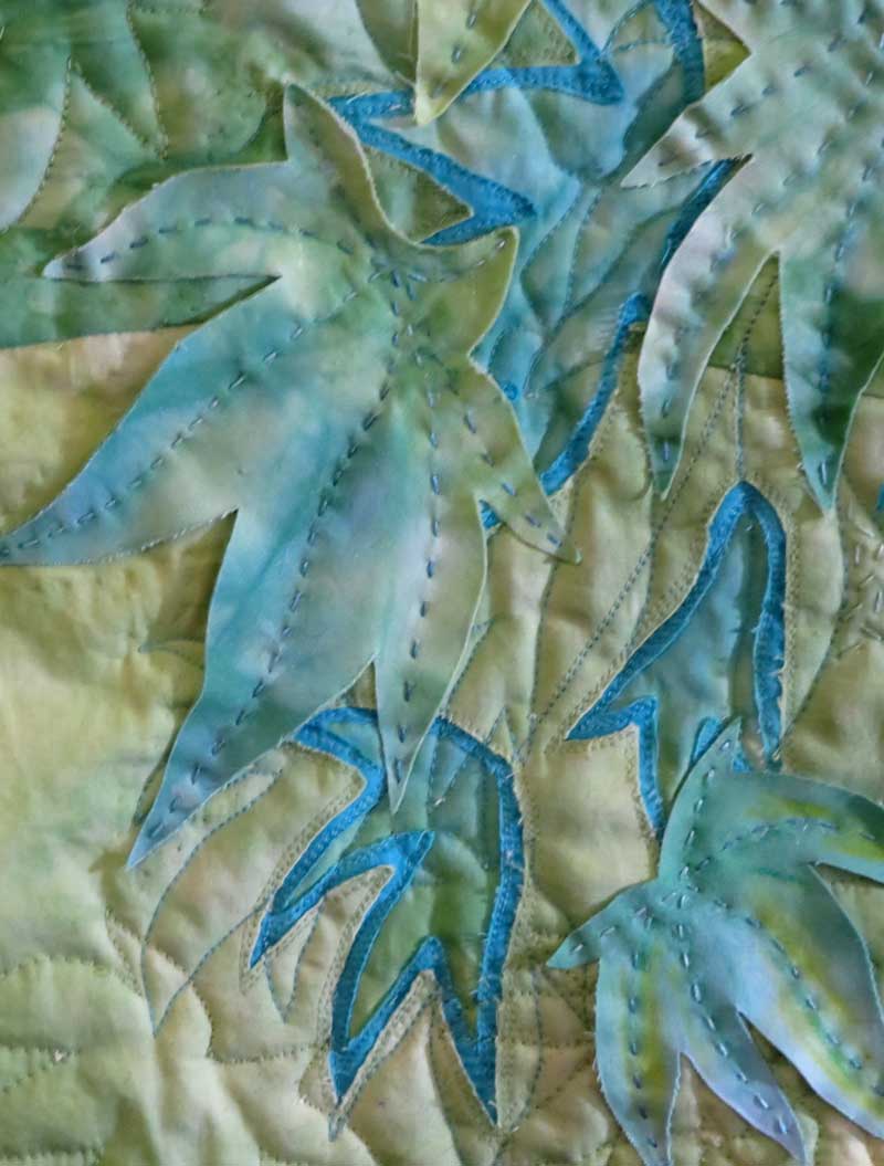
This seemed like a good opportunity to try our another idea for adding a dimensional effect, by using what I might describe as free form applique.  In this case I stitched the leaf shapes to the piece along the vein lines so the edges are free to lift and curl.  

I have also been adding some hand stitching for texture to complement the machine quilting which is less dense than my usual style (the hand stitching is  nice work to do in front of the fire on these chilly evenings!!)

And now in a completely different style .... I've added another layer of dark tone to the drawing class challenge piece from last week.   I've used "shards" of dark turquoise silk and covered the piece with some wedding tule to keep it in place. 

I'm still playing with it and there is still the stitching to be added .... what do you think.... an improvement????

Thanks for reading ......CC

New Grevillea Artwork Underway

This week I 've had my head down,  working on the next Grevillea piece and specifically the stitching ....  

The design has come together with the applique and reverse applique completed.  This piece at 20" x 30"  is somewhat  larger than much of my recent work ... so its taken a bit longer to get to this stage and takes more time to stitch and there is a deadline looming!  Great motivation!!

The big questions now revolve around the quilting and choice of thread color.  After a few experiments,  I've settled on the stitching around  the flowers and the reverse applique shapes, but have yet to decide on the other areas!!  

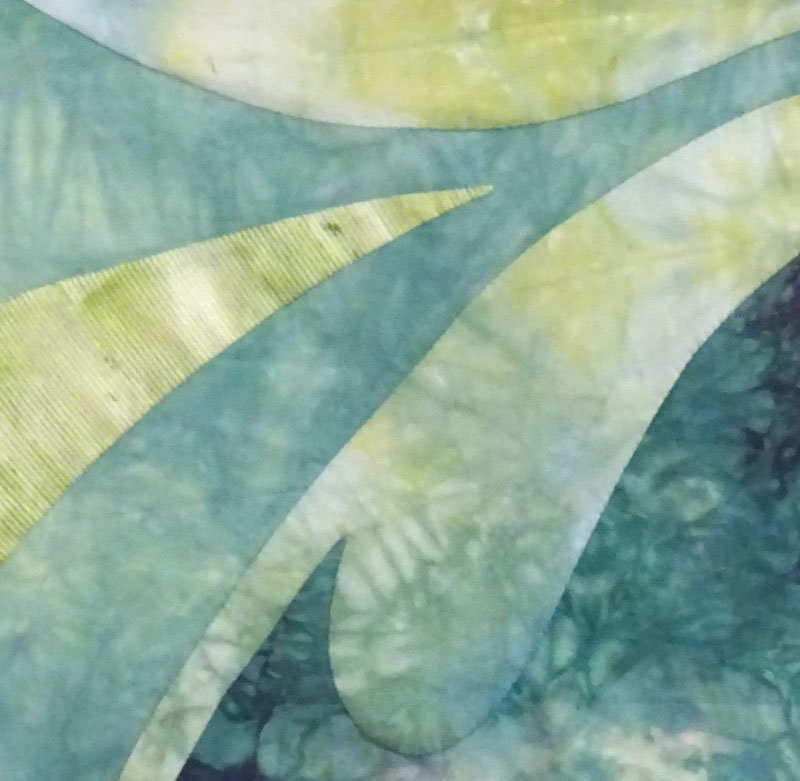
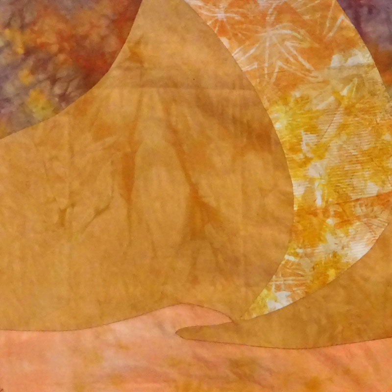
                                  © CarolynCollinsArt 2017  'Grevillea 8  Detail'   

                                  © CarolynCollinsArt 2017  'Grevillea 8  Detail'   

So back to the stitching .....   Thanks for reading ....  CC

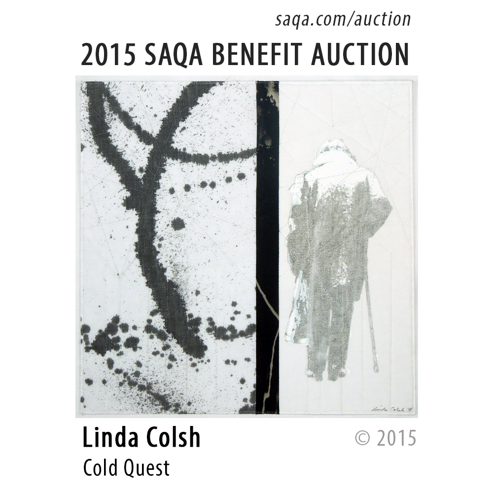
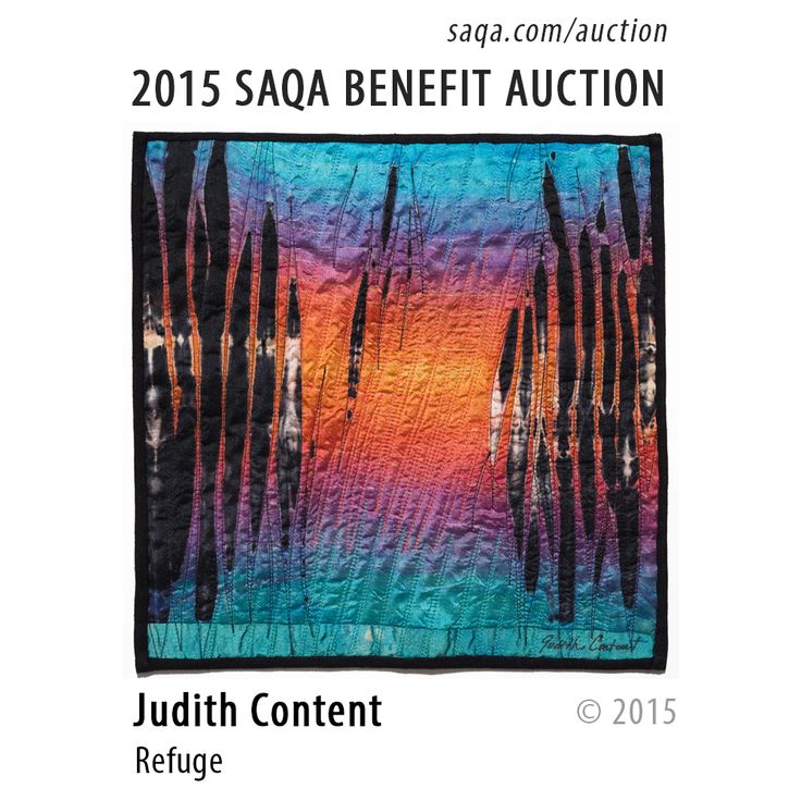
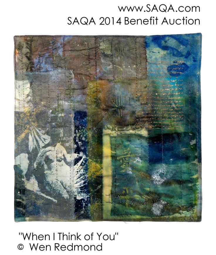
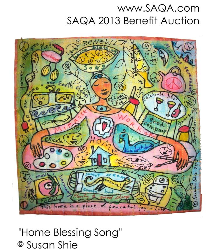
Studio Art Quilt Associates (SAQA) 2017 Benefit Auction

This is the 11th year of the SAQA Benefit Auction,  which raises funds to support SAQA's exhibitions, publications and educational programs.

Last year more than 430,  12" square quilts were included in the auction ... the largest number ever!!   "When the auction started no-one knew how it would be received or how much fun it would be to keep creating quilts year after year"

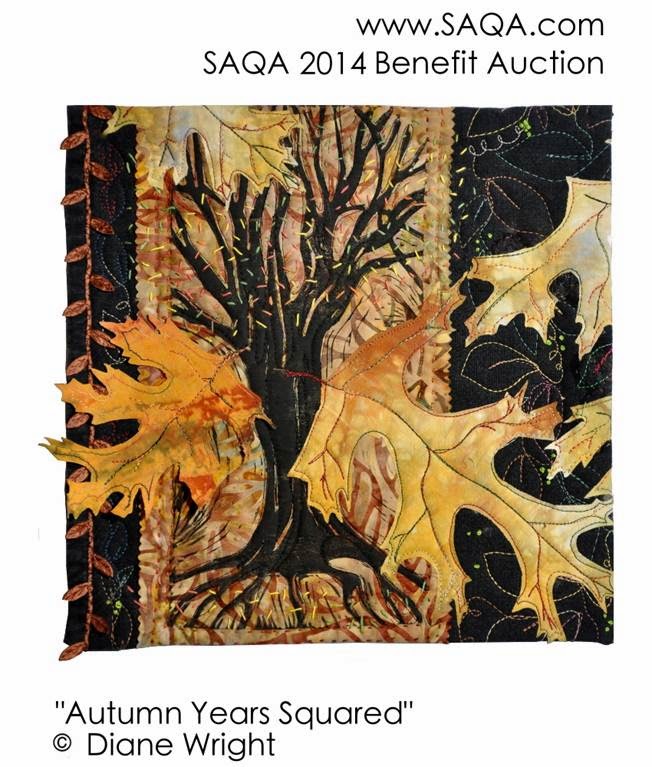
SAQA reports that there are 15 artists who have donate every year since the start in 2006 andI thought it would be fun to have a look at some of the artworks donatedby these amazing artists ......

This is my second year of donating to the Benefit Auction ....

I've sent this piece for the 2017 Auction .......  it's one of the grevillea samples that I made earlier in the year ....

Grevillea

'Sunset Bronze'

CarolynCollinsArt 2017


You can find out more about the SAQA Benefit Auction and see all of this years donations at www.saqa.com

Perhaps you might find an artwork you love !!! 

Thanks for reading .....  CC

Art on the Wall

This week I've been focused on getting 'art on the wall'!

The first task was to deliver artworks to Jing Jo's Cafe in Kangaroo Valley for the new show 'Still Life' which was hung this week.  If you happen to be in the vicinity I would highly recommend dropping in for a coffee and checking out the art!!

I sent across three of my framed and stitched 8" x 10" monoprints .....

as well as a larger, pieced and stitched monoprint  16" x 20"  mounted on a stretched canvas ....

StitchedLifeinBlue1.jpg

Stitched Life in Blue 1

It's always a challenge for me to photograph groups of artwork on the wall  ... we have an old house with lots of timber panels and strips of timber dividing the wall space.  
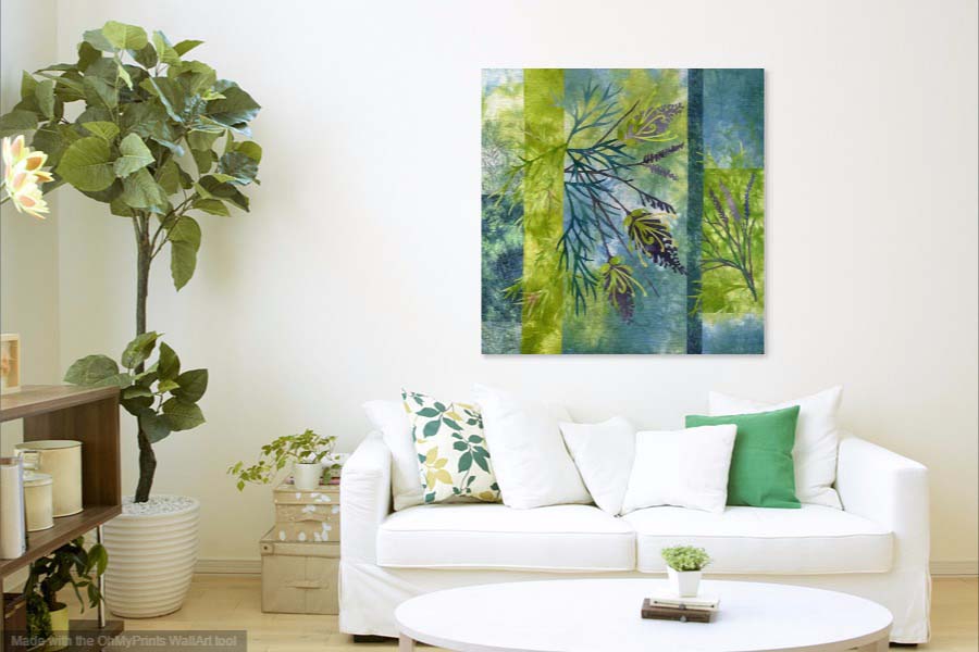
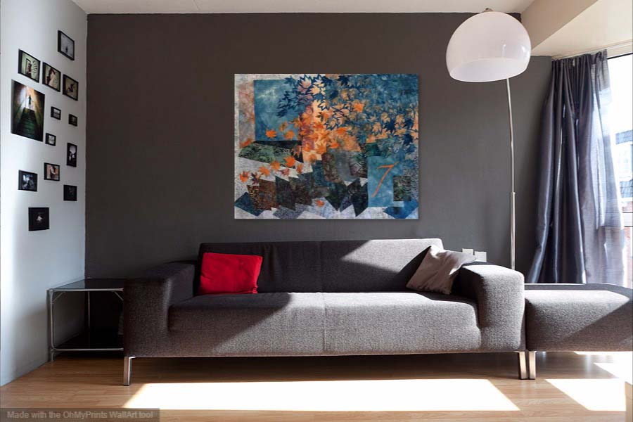
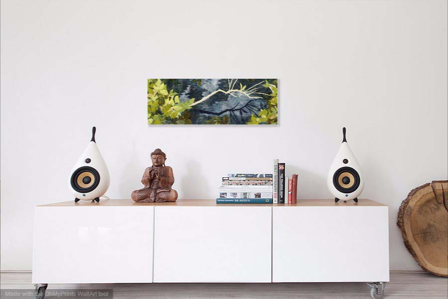
So while I was browsing the internet for some ideas, I came across a free app called WallApp which lets you upload a photo of your artwork so you can see what it looks like in a room/living space - there are half a dozen room options and you can also upload a photo of your own room.

Here are a few examples ......

It's very easy to use and quite fun!!! 

This led me to thinking about the reasons for choosing a piece of original art/textile art for your home.  The following are my thoughts about the possible reasons .....

The textile art creates a mood or feeling that can evoke memories or take you to another place.  It adds personal character,  can provides a color palette for the room and makes a room feel finished.  It's something to look at and contemplate,  especially  if it is a work that speaks to you .....  and can inspire and foster creativity.

Textile art particularly,  adds warmth and a softness,  it creates a connection with the makers hand that has created the work and to a long tradition working with fabric and stitch.  

What draws you to a particular piece of art/textile art ... something you own or would like to??  Please comment on why you have chosen to buy a  particular piece of art....

Thanks for reading .... CC

An Afternoon with my Gelliplate .......

This week I spent an afternoon printing with my gelliplate!   I tried some experiments and worked  on printing some fat quarters of fabric for the next grevillea design ....

The experiments were inspired by a short online class with Carla Sonheim,  that I purchased recently. 

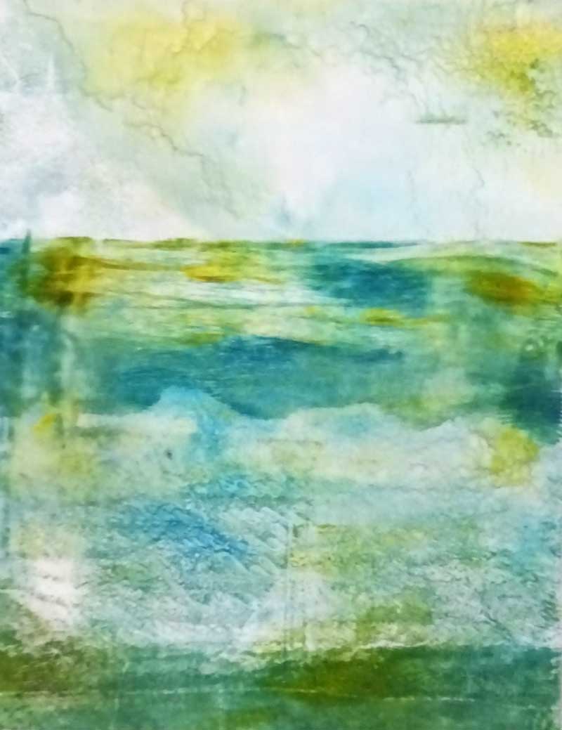
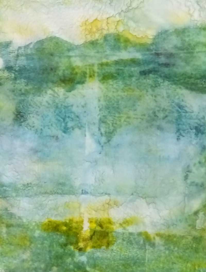
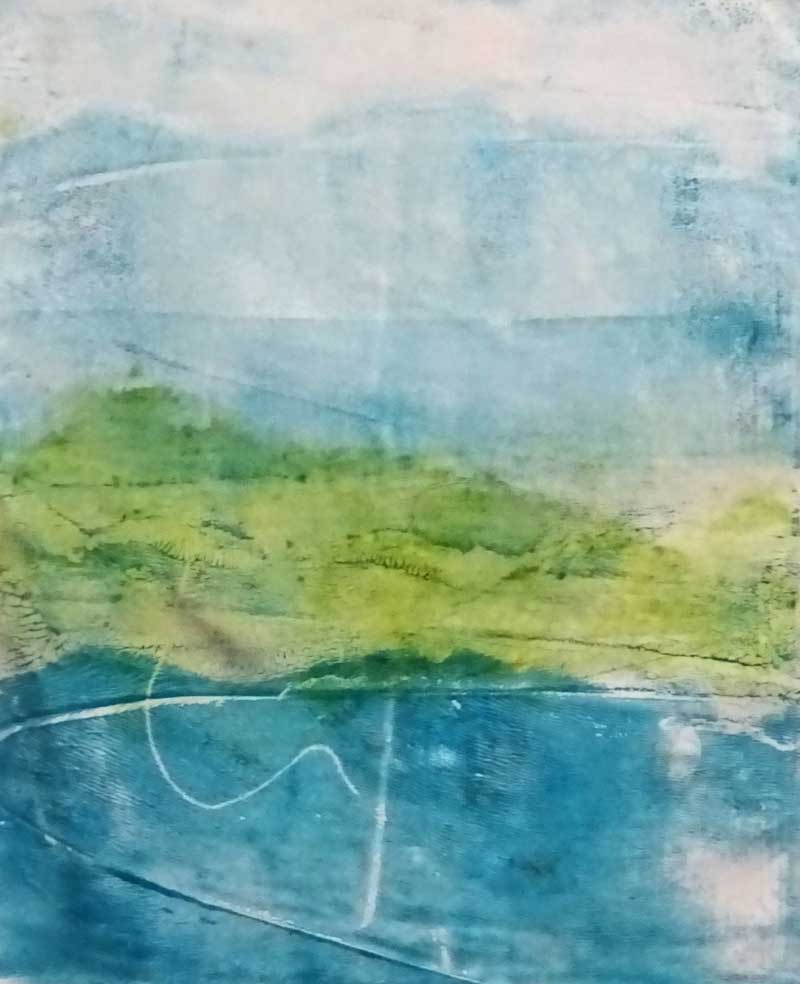
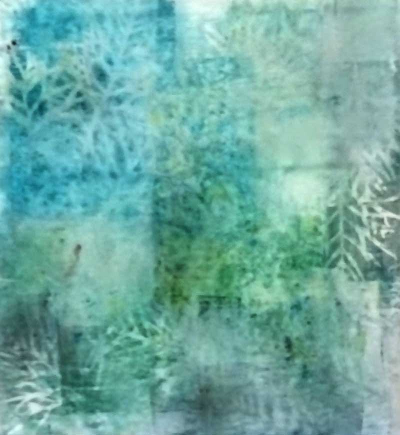
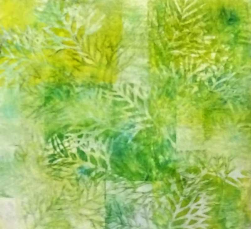
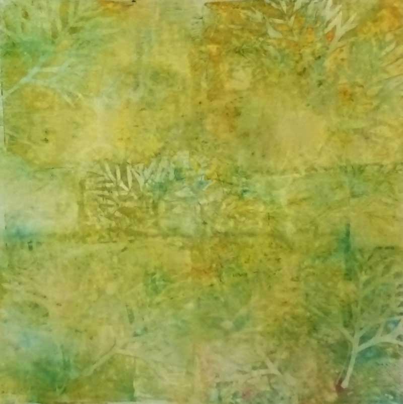
Carla's technique produces some lovely abstract monoprints with a landscape feel so I was keen to try it out.  Here are some of the results ......

I think  these have a lot of possibilities as backgrounds for a new idea I have .......

The fat quarters for the new grevillea design are printed using grevillea leaves and a couple of abstract stamps.  I wanted a subtle, blended print without too much contrast,  to use in the background.  Printing fat quarters means repeated placement of the gelliplate and sometimes this results in a build up of paint in some areas.  I tried lightly washing off the excess which worked very well and helped with the blended effect I was looking for .......

A good afternoons work I think!

Thanks for reading ......CC

New WindingWay Landscape

This new piece has been reworked a few times .... I was pretty happy with the landscape background but struggled to find a fabric for the overlay.  In addition,  this piece at 16" x 16"  is larger than the previous works in this series so that added an extra challenge for the composition!!

                                 'Winding Way in Pink'  © CarolynCollinsArt 2017  16" x 16"

                                 'Winding Way in Pink'  © CarolynCollinsArt 2017  16" x 16"

The larger size of this piece called for a rethink which resulted in the addition of some new elements ... a more complex landscape background and in this piece a digital image printed on organza which adds  a nice sense of depth.  

I thought it would be interesting to look at the development of this series to date ... starting with the first compositions at the bottom left   ......

The next step is to develop and refine  this larger design .......

Thanks for reading ...........  CC

A Question of Background ....

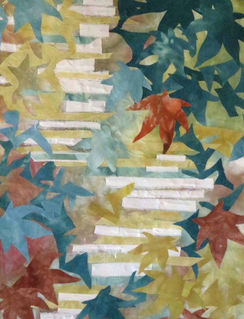
The most recent pieces in my Grevillea series have used strip pieced backgrounds ... a mix of hand dyed and hand printed fabrics to add some variation.  

This approach worked nicely but what if I 'push the boundaries'  a bit ...

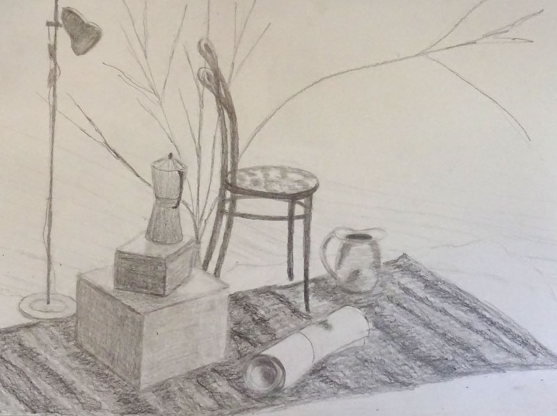
Artists often create compositions from small areas of detail in a drawing or painting, scaling up the size to create and new composition.  We used this approach in my weekly drawing class recently.  

We started with a still life drawing and then using a small area of detail from that drawing created a new composition and then added tone and color ......

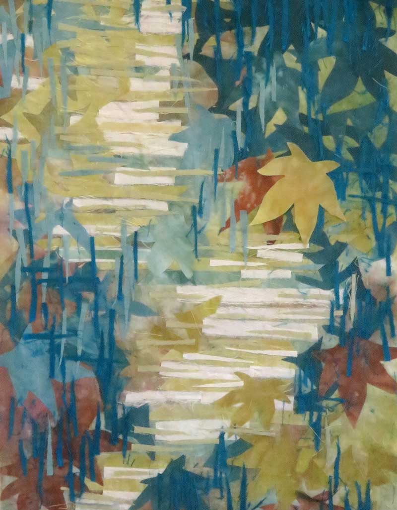
From one of my Grevillea drawings I made a number of detail sketches looking for compositions with 5 to 7 shapes.  I picked  3 to try out and made them up this week .....

I'm pleased with the way they look ... the shapes and the color combinations.  The plan is to stitch my Grevillea flower drawing onto these backgrounds ... so I'll need to work out the color and weight of thread and the best way to place and mark the design.   

I'm hesitating a little bit about the stitching so I keep telling myself I can always make a new background piece if I mess it up!!!!  
I'll let you know how I get on......

Thanks for reading  .....CC


On the Wall ... Turquoise and Green

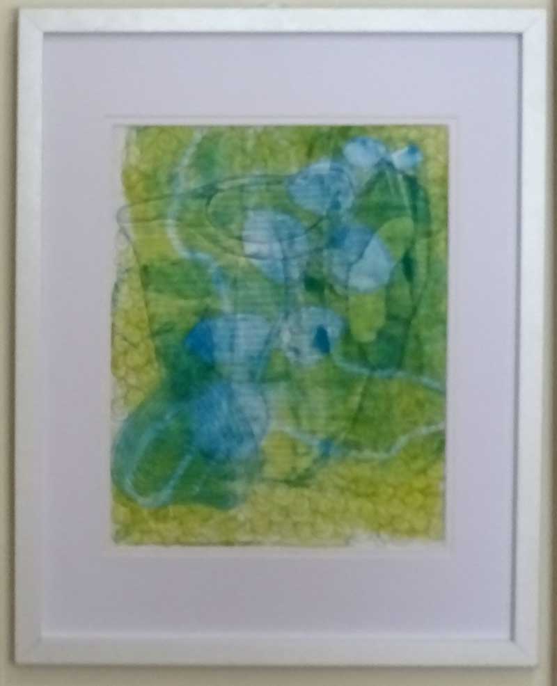
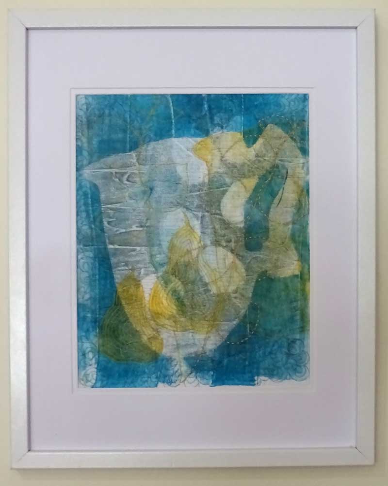
My design wall is usually filled with work in various stages of design and construction ...   at the moment there are a couple of pieces.... monoprints in blues and greens .... basically complete with stitching and facings, just waiting for the next steps in the process.

I recently completed work on the latest Stepping Stones piece "Lake in the Clouds"  which includes some favorite turquoise fabric, the same fabric that I had use to complete the monoprints.

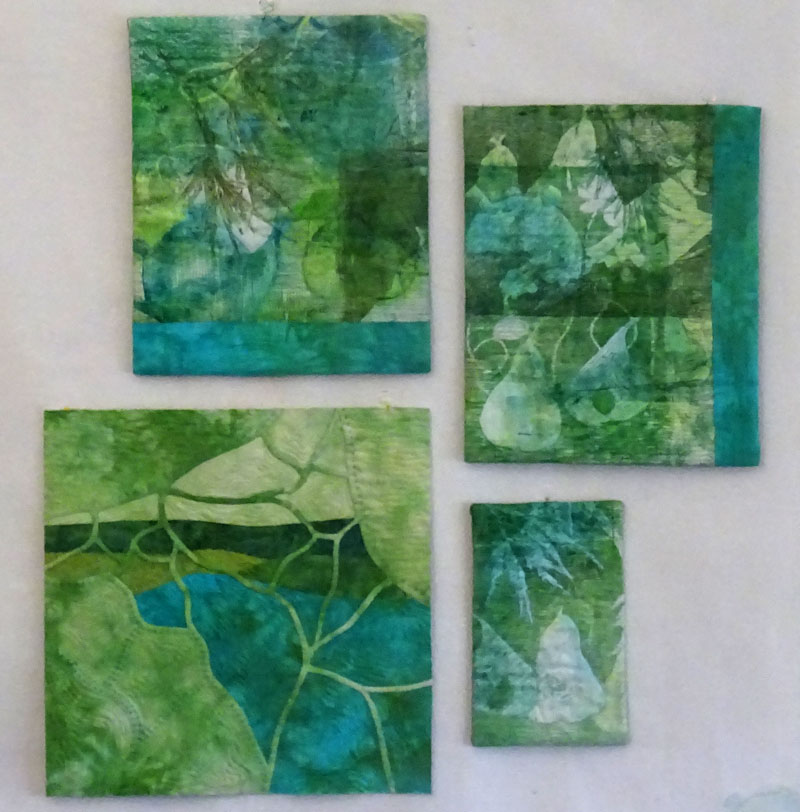
The two monoprints looked a bit unbalanced when I hung them as a pair because of the way I'd placed the turquoise fabric.  But when I set them with the new Stepping Stones piece and a miniature piece, I thought they looked terrific as a set .......

                " Turquoise and Green"  © 2017 CarolynCollinsArt   Set of 4 pieces

                " Turquoise and Green"  © 2017 CarolynCollinsArt   Set of 4 pieces

This got me thinking ....  while many of my pieces are relatively small they have the potential to work really well together in sets.  

 I've recently been working on upgrading my Pinterest site so I've added a new board  "On the Wall"  and  started pinning ideas for grouping art on the wall  ... here is a link to the board if you are interested ....

 https://au.pinterest.com/carolyncollinsa/art-on-the-wall/

Do you have any tips or suggestions for hanging groups of art or photographs ?

Thanks for reading   .... CC