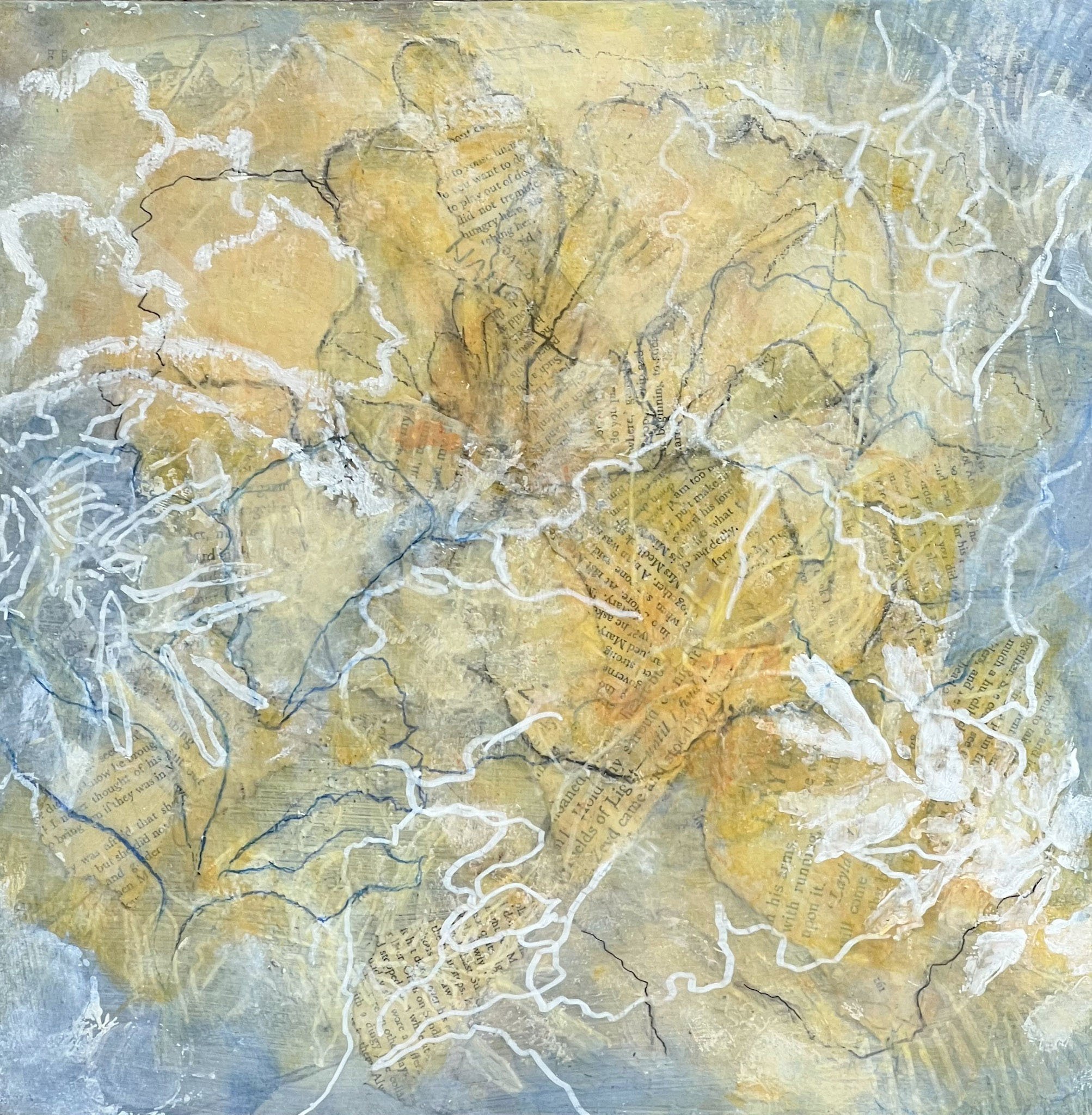
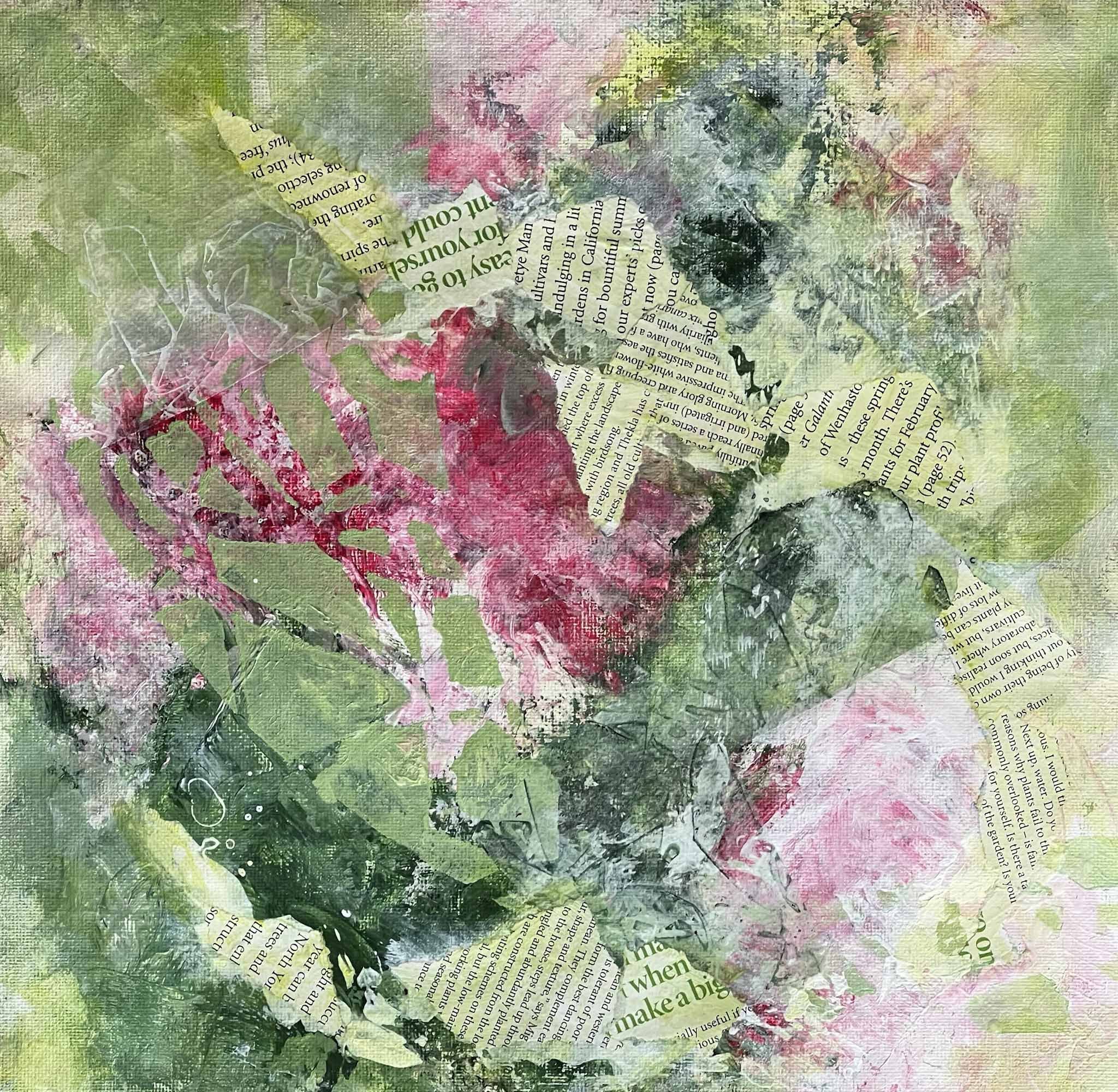
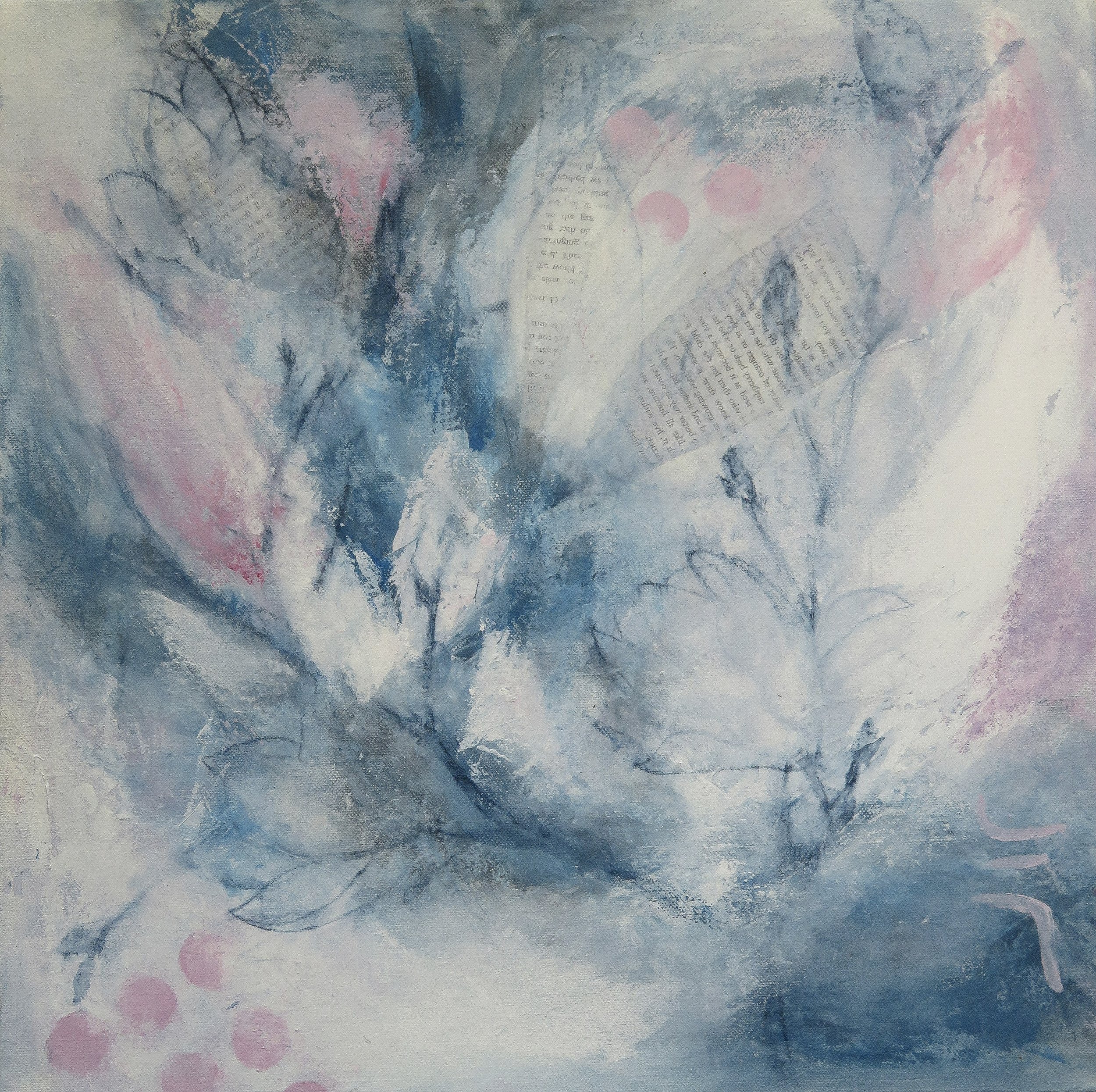
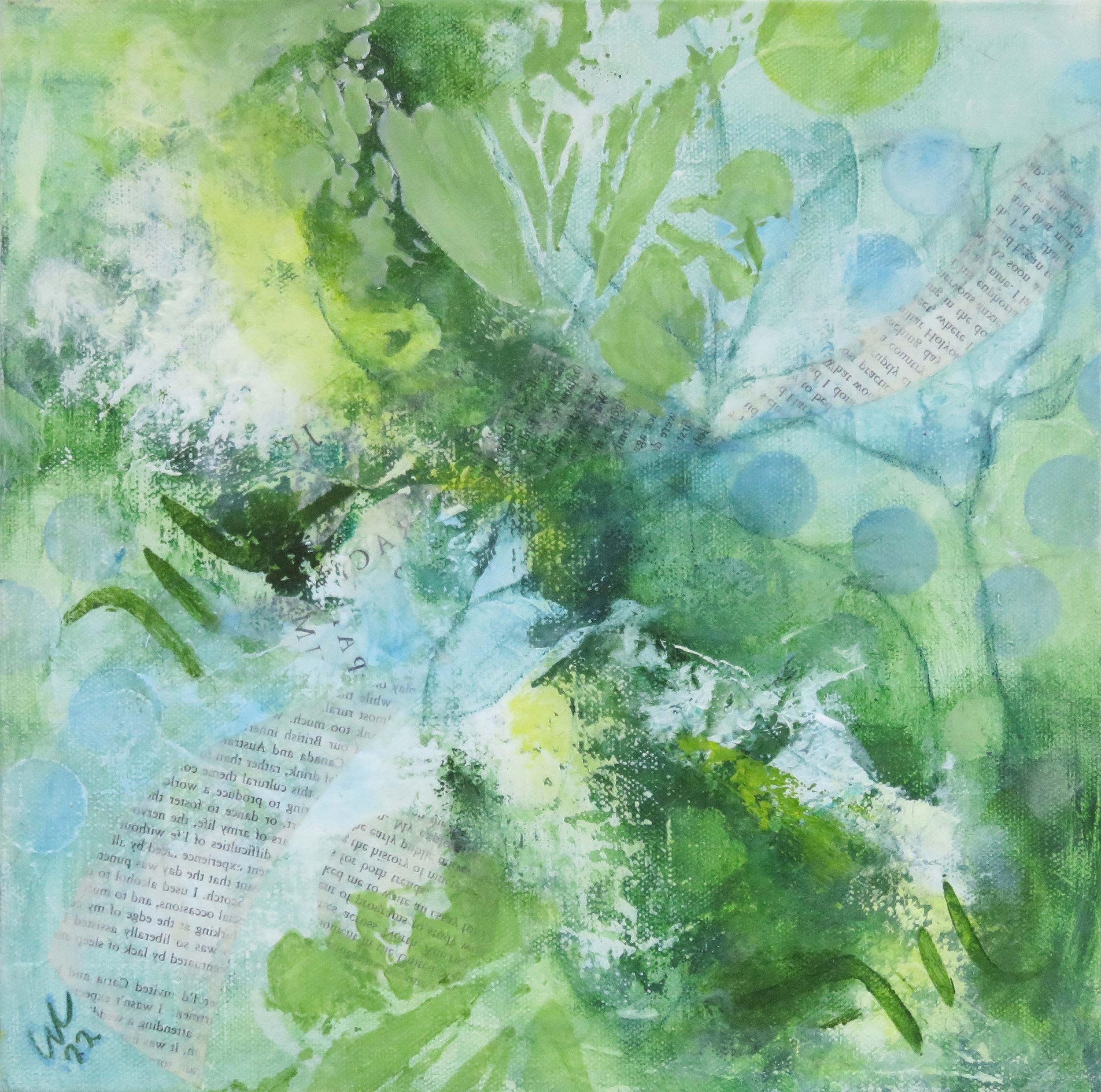
Carolyn Collins Art

Pigment Possibilities

Hi there

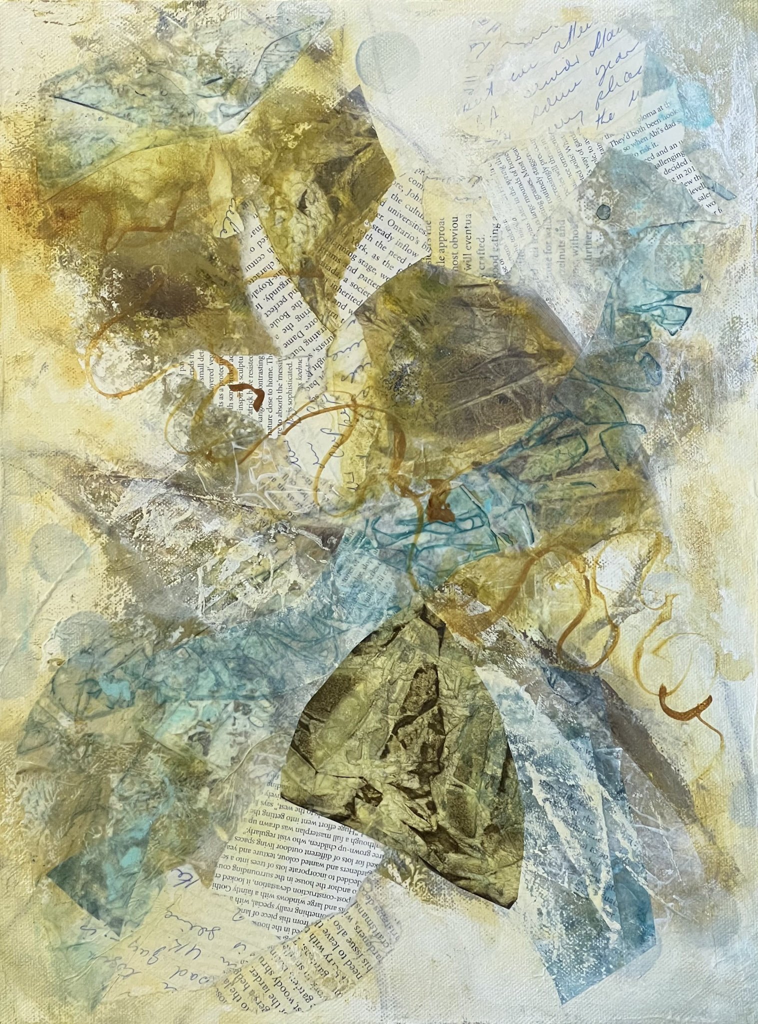
.... since I returned from my trip to India I have been exploring the possibilities of using natural pigments in my work, the powdered particles that are the source of colour. Pigments can be derived from stone, earth/clay, plants and even waste metals and materials.

The attraction for me is in being able to incorporate a connection with place ... with the earth/land in my work. I have started using some pigments in the recent works inspired by India, where they contrast beautifully with the vibrant colours of Indian life.

Ultimately, I am looking to create a direct connection, where it is possible ....for example: where a pigment that is drawn from the mangroves is used in this series of works.

To start, I bought a selection of earthy pigments to try out ....

I have been experimenting with different ways of working with these pigments and I'm using an acrylic medium to create a paint or glaze (you can also use oil or watercolour mediums).

Some of the pigments are quite a challenge to blend into the medium, others mix easily, but they all bring quite a different character to the work.

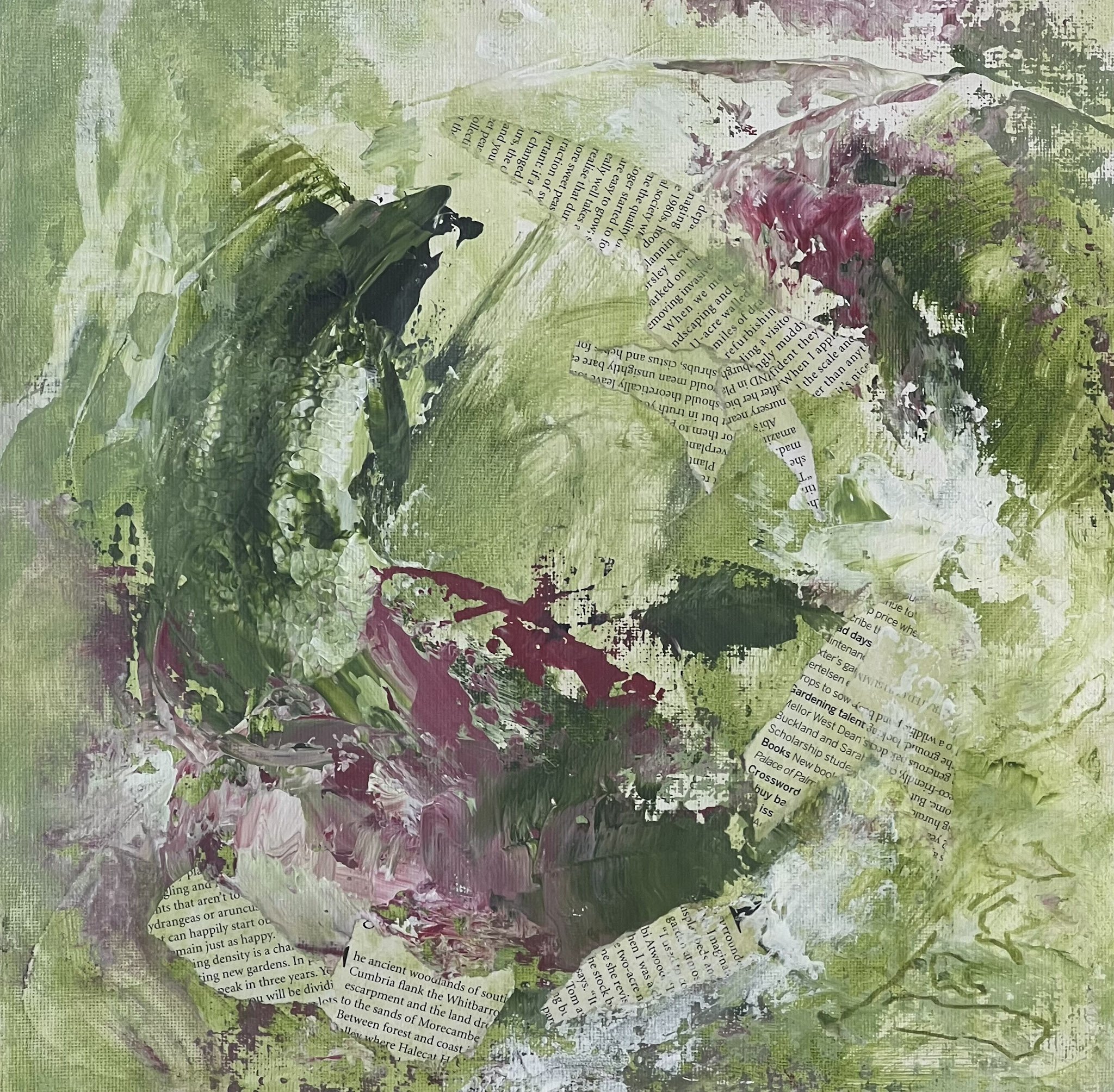
I have learned that when combined with the texture of collage you can create some lovely edges and tone-on-tone marks!

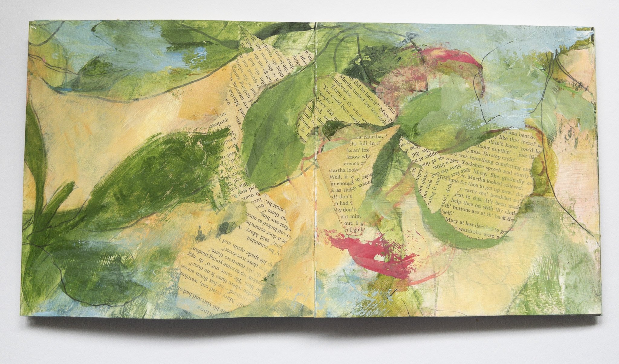
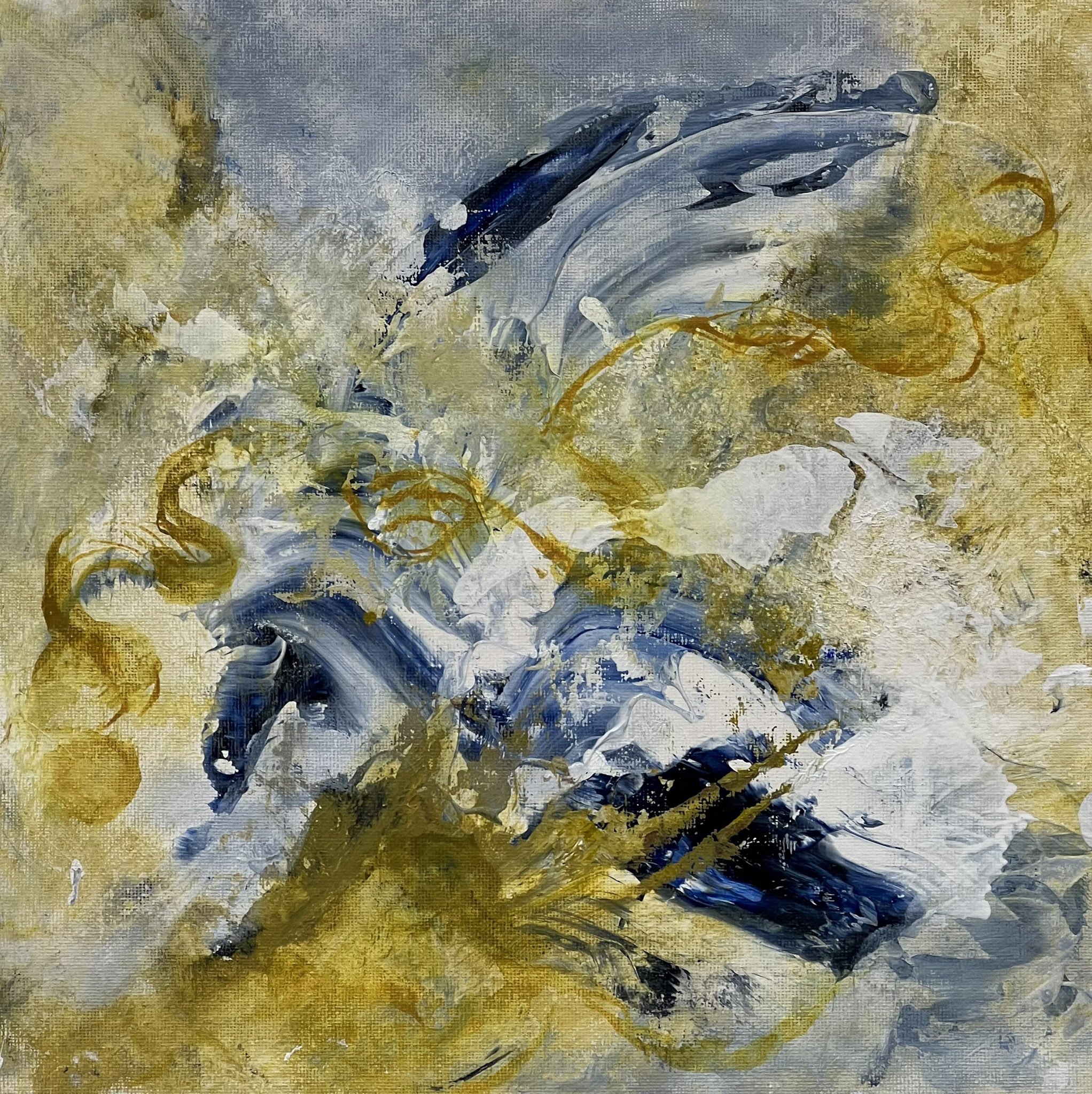
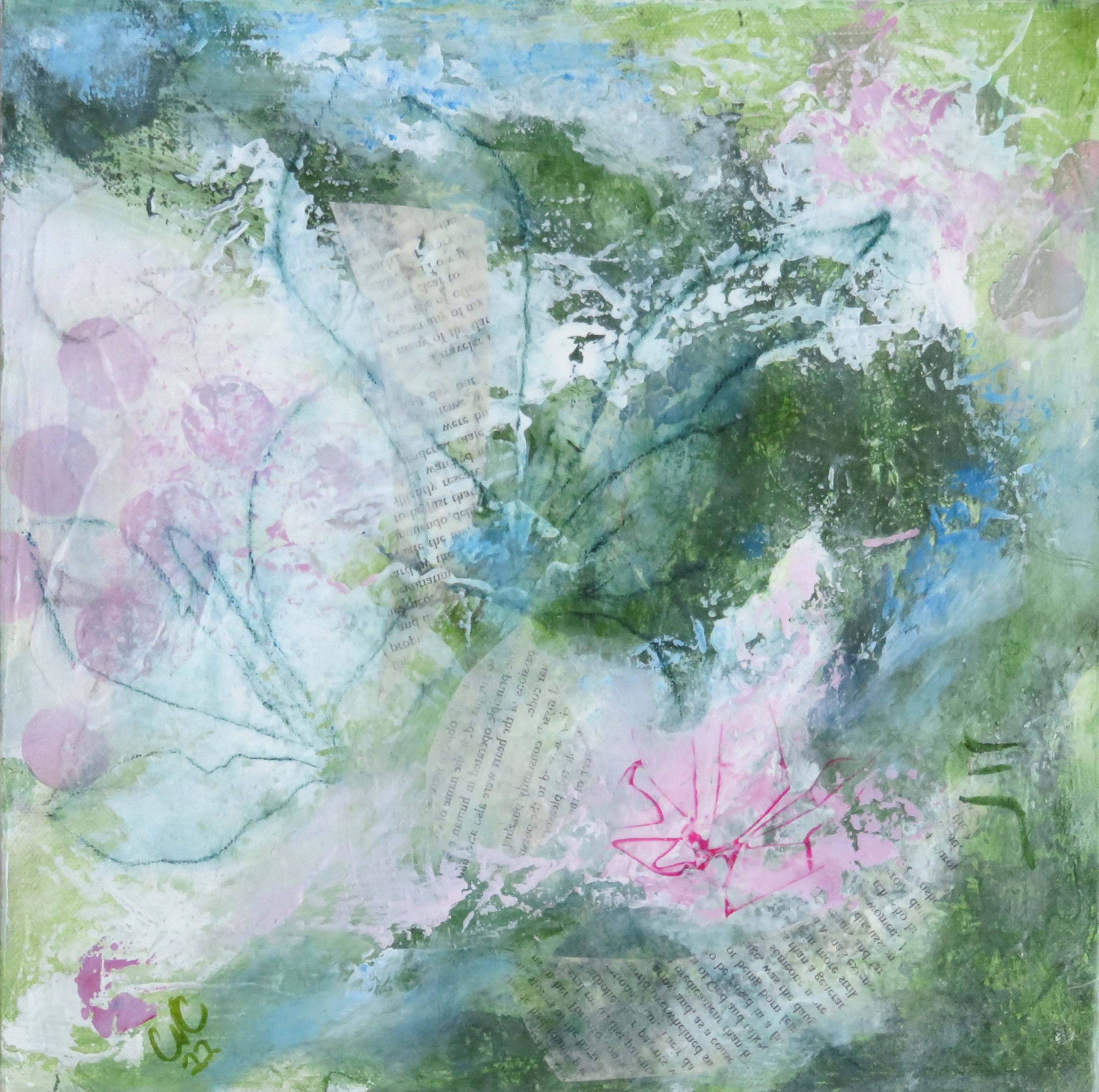
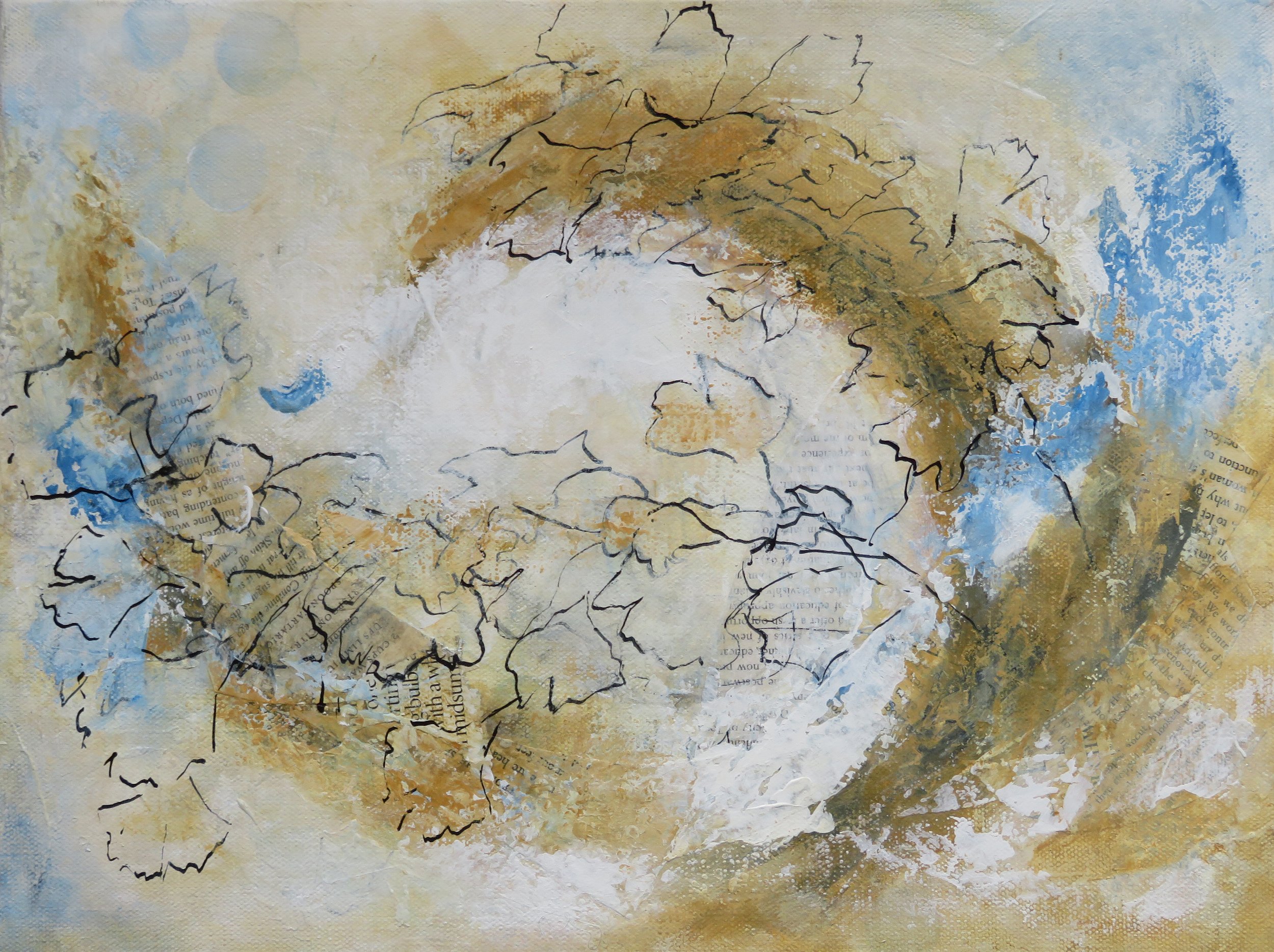
These two works from the India series are my first explorations with pigments. In the first 'French Earth' pigment has been added as a glaze to provide a soft contrasting tone to the acrylic paint. In the second 'Venetian Red' has been used to add a textured effect on the righthand side.

Acrylic paint, found and made collage papers, pencil, ink, earth pigments

If you missed the post on India you can see it HERE

There is much more to explore here, for example:

  • different medium and pigment combinations

  • texture combinations

  • making pigments from the raw materials

and I have found some excellent resources to help!

I am particularly inspired by the work of LondonPigment artist Lucy Mayes who makes recycled pigments using urban waste stream materials.

and

the PigmentLab workshop offered by Emily Jeffords which provides a comprehensive review on finding, making and using natural pigments.

What is most exciting to me, is to see the effects of working with natural pigments alongside traditional colour and what that might bring to my work.

Thank you for reading, your time and support are much appreciated .... CC Always

A Yellow Start to 2024

…. yellow is a colour that always draws my attention and is a favourite of mine, I was married in a lovely yellow dress!

This week I picked up a new art book ‘The Secret Lives of Colour’ by Kassia St Clair.

In the introduction to the book Kassia describes her approach ... “I take a colour and pull it apart at the seams to discover it’s hidden mysteries …”

It's the sort of book that is ideal to dip into whenever the opportunity arises. Under the heading of Yellow, Kassia writes about …. Blond; Red-tin Yellow; Indian Yellow; Acid Yellow; Naples Yellow; Chrome Yellow; Gamboge; Orpiment; Imperial Yellow and Gold.

So I started with Yellow! No surprise …

This section covers a lot of territory, travelling from the 1895 arrest of Oscar Wilde “What decent many would be seen openly walking the streets with a yellow book” to India where yellow is symbolic of peace and knowledge, and is particularly associated with Krishna, who is generally depicted wearing a vivid yellow robe!

For me the greatest interest lies in the stories of the early yellow pigments and that “with the exception of the yellow iron ochres, which even at their best tend to be a little dull and brownish, there were no yellow pigments that were completely reliable until the twentieth century”.

Inspired by my new discoveries about colour, I'm now getting back into the flow of my art practice and have been playing with ….

1.

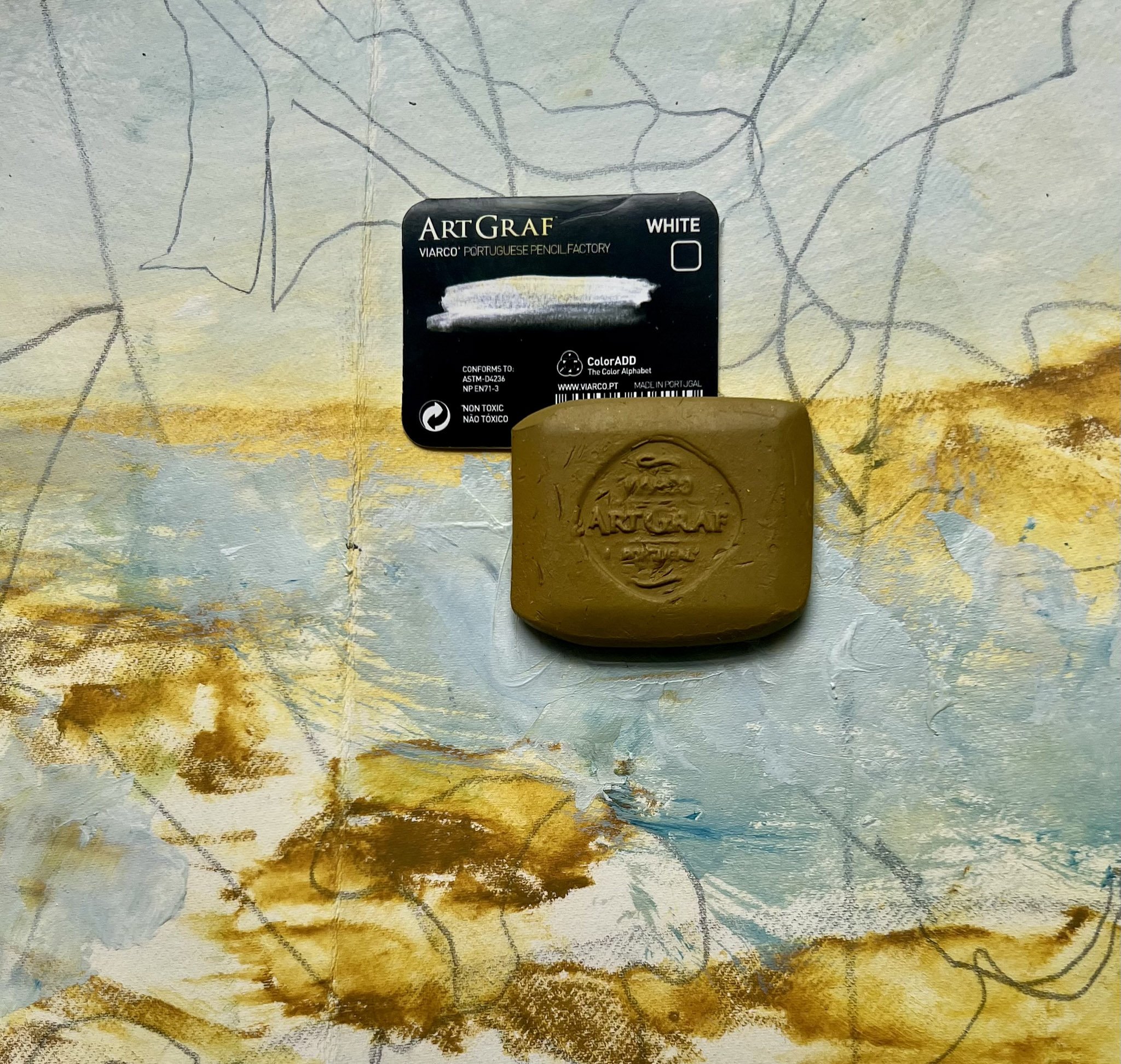
Sketching using an Art Graf square block in yellow ochre! The square is water soluble as well as being soft and rich – very satisfying to work with!


2.

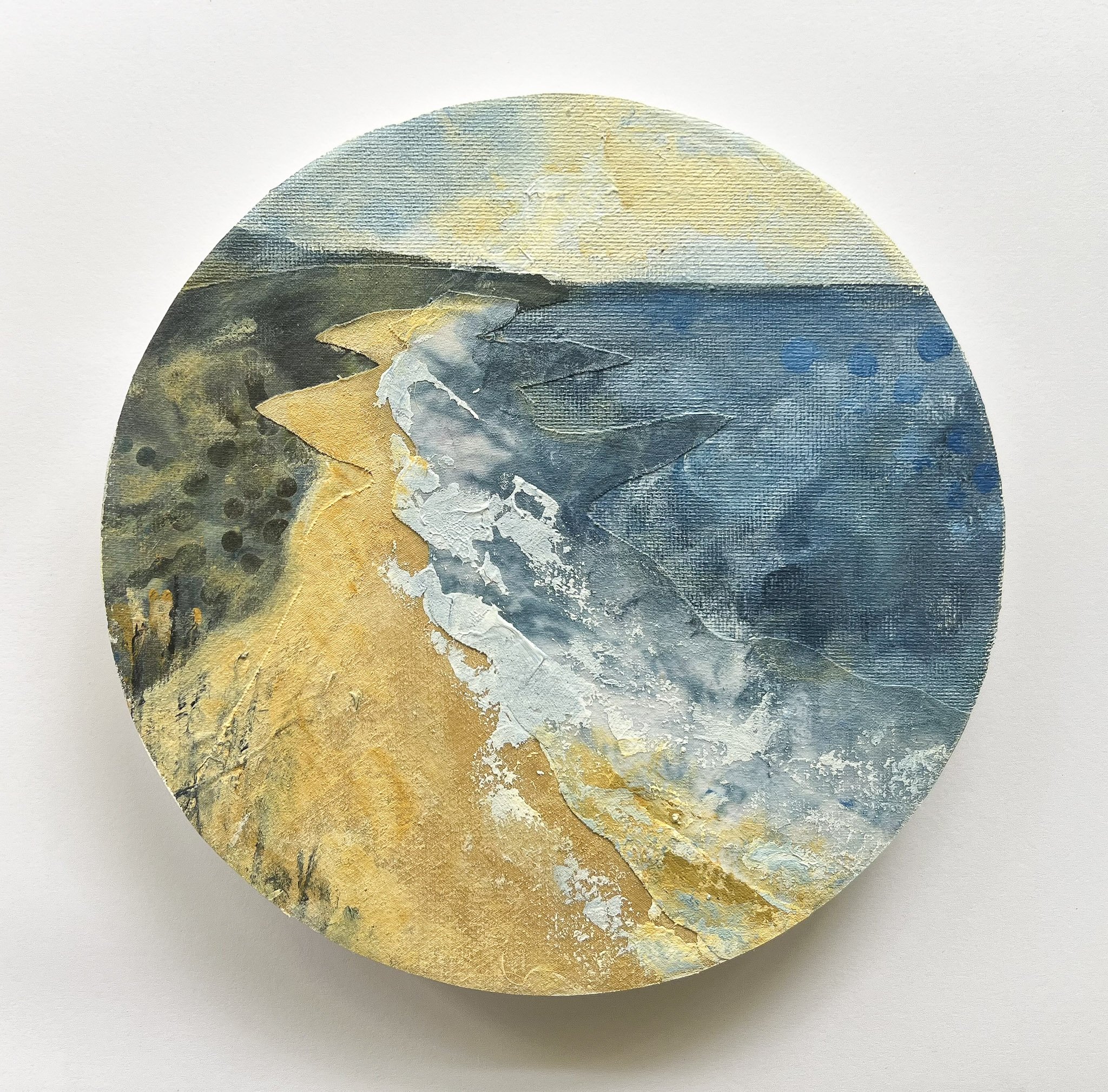
Using some of my still large stash of fabric as a collage material in some small paintings … this little piece is 20cms in diameter, acrylic paint and fabric collage on canvas, mounted on wood panel.3.

3.

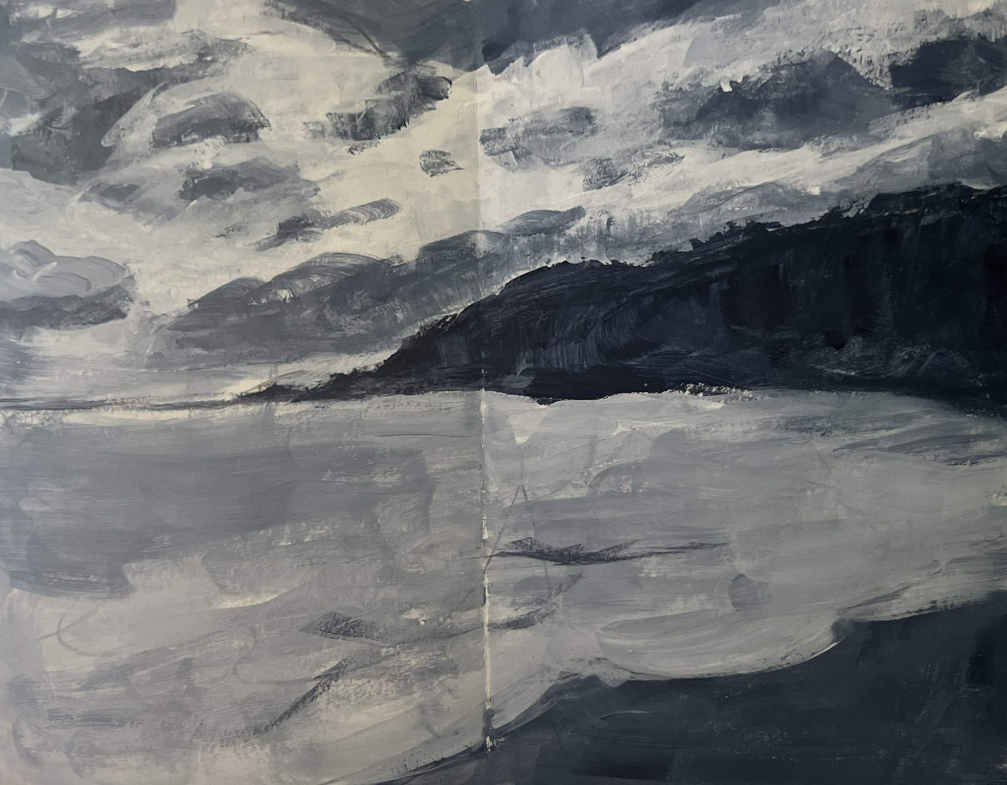
Painting small, quick studies inspired by my return to the pleasure of regular beach walks (when the weather is co-operative !)

I think this may be the start of a new series of work for me and I’m excited to see where it goes!

So 2024 is off to a fresh, yellow and interesting start!

I hope your 2024 is filled with colour, reasons to celebrate and new adventures ….

Thank you for taking the time to read … your interest and support is greatly appreciated!

Till next time CC

Loving my Handmade Concertina Sketchbooks ....

About this time of year my focus returns to my sketchbooks and thoughts of the next evolution of my art .... and a new sketchbook!

Purchased sketchbooks have their limitations....

  • size/format of pages

  • weight of paper especially for wet media - availability and price

  • painting only one spread at a time

So this year I've decided to make my own concertina sketchbooks. Found some 300gsm paper (on sale!) and have cut it into 19cm (7.5 ins) strips and I can join as many of these as I like! This gives me a 19 x 37cm (7.5 x14ins) spread and so many options.

My first was a smaller version, exploring ​one of the techniques we learned in drawing class, as we made our fabulous collaborative work for the show at the Shoalhaven Regional Gallery.

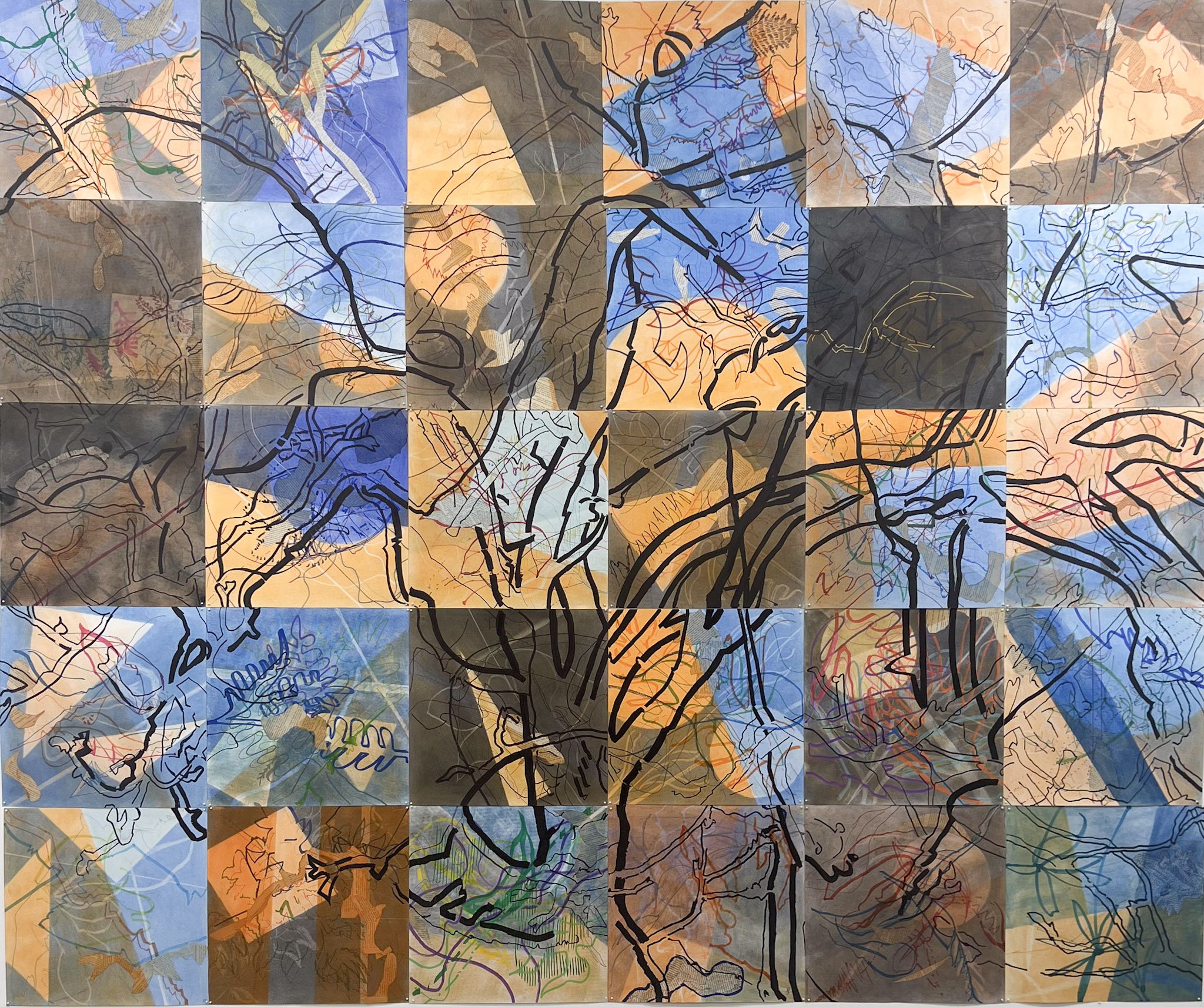
This is the final version of the collaborative work from our DRAW23 exhibition on the wall... it was over 2m square!


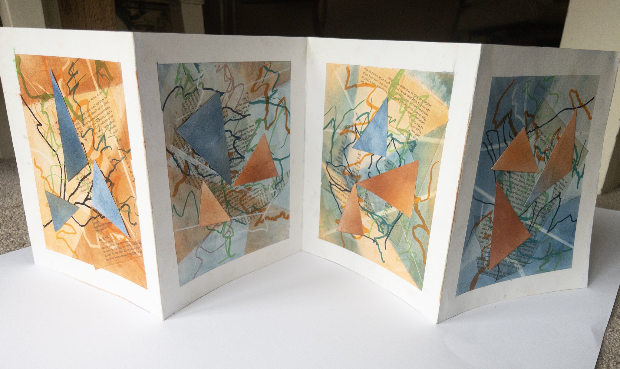
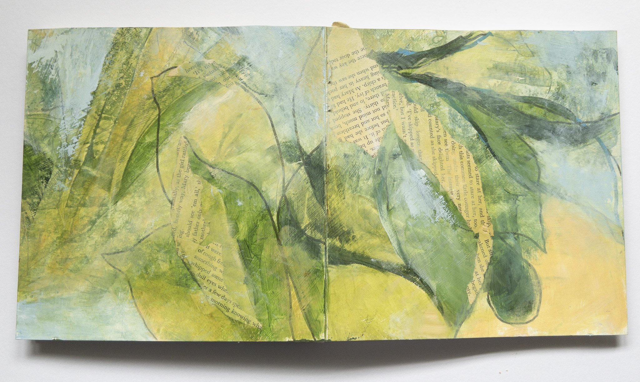
When it came to thinking about a new colour palette and the next evolution of the Songs of The Garden series - I joined 3 strips together for this long book and just kept playing ... lots of fun, no waiting for the paint to dry but not easy to photograph!

For the next one …

​I decided to try throwing some colour and drawing onto the art paper before making the concertina book and seeing what happens .....

I'll keep you posted!

Thank you for taking the time to read … your interest and support is greatly appreciated!

You are very welcome to forward this email to anyone you think might be interested.

If you have any comments just reply to this email, I love to hear from you ....

Till next time .... CC

Always
Virtual Gallery in the Making!

One of the things that has been on my wish list for quite some time has been to set up a virtual gallery for my art.

This seemed like it might be a tall order for someone who started out with technology in the days when you had to use punch cards and deliver them to a mainframe computer!

However, over recent months things have started to fall into place:

  • I discovered that ‘Artplacer’ – a platform that I have been using to develop ‘in situ’ images of my artwork, offers a number of virtual galleries and is very user-friendly …

In Situ example

  • The opportunity to be part of a joint textile art exhibition arose and as I was looking at the work for this show I realized what a large body of textile work I had!

So I made the decision to set up a virtual gallery of my textile artworks!

My experience with exhibiting work with galleries to date has been limited largely to providing the work.

The curatorial decisions about the way the work is presented has been in the hands of the Gallery or the group organizing the exhibition.

With this project those curatorial decisions are all mine!

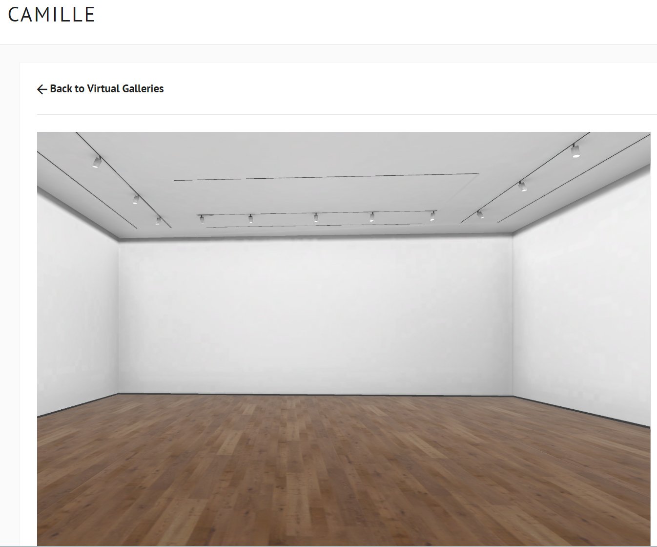
In addition, a virtual gallery is not constrained like a physical gallery – it’s a blank canvas! it is possible to change the colour of the walls, floors and ceilings, the position of work and other elements that might be added, meaning there are a myriad of possibilities!

After playing with the options and getting to know how it all works I realized I needed to be clear about the experience I wanted to create ….

  • what is the exhibition all about – the themes, the inspirations and what ties it all together;

  • in addition to the art work, what other visual elements would support the story I want to tell;

  • how do I want the gallery space to look and feel and

  • how does all this translate into designing the gallery space from a practical perspective.

After much consideration, my aim is to create an immersive experience that will give the viewer a taste of the ‘landscape’ that surrounded and inspired me and helped to create the artwork that is part of the exhibition.

The exhibition is built around the final major work completed in 2019 called ‘Golden Days’ and will include works from the three main textile art series I worked on during the period 2014 to 2019.


The exhibition is falling into place nicely which is very exciting ! … just some of the behind the scenes work to complete.

My plan is to launch the exhibition on my website in early September and

I will let you know as soon as the exhibition is live on my website!

Thank you for taking the time to read … your interest and support is greatly appreciated!

You are very welcome to forward this email to anyone you think might be interested.

If you have any comments just reply to this email, I love to hear from you ....

Till next time .... CC

Freedom to Explore

Hi there

... without the pressure of a new exhibition these past few months, I have taken the opportunity to push my work in a number of different directions, exploring ...

  1. Using collage elements as the feature vs using them as minor elements or background

  2. Making works that are just painted vs making work that is just collage

  3. Using more drawing and/or more pattern in my work

  4. Using glazes and thin paint vs thick paint

This grid shows these variations (in order) ...

I have also been spending some time revisiting that amazing and unending study of colour, exploring more colour mixing, different colour palettes and ways of using them! So much to learn here!

So where did these explorations take me and what do I want to pursue ….

I am very drawn to the work where the collage is featured (especially the text) rather than just an element or background - perhaps a new series?

Areas of thin paint that allow drawn elements/collage to show through so you can see the layering draws me into the work … so more of this!

As I learn more about the practical side of colour I am keen to push my colour boundaries!

Talking about colour, a recent article about the Pierre Bonnard Exhibition, which has just opened at the National Gallery of Victoria caught my attention! Bonnard is know as a master of colour and this exhibition looks amazing!

See a taste of the exhibition in the short video introduction from NGV (2.38mins) Link below .... it's on until October so I'm hoping to find an opportunity to visit!

NGV - Bonnard Exhibition Introduction

Having the space to explore and play is so helpful! It's a way of energising and feeding my art practice and keeping my art moving forward!

I enjoy writing this journal and nearly always find I discover something in the process!

Thank you for taking the time to read … your interest and support is appreciated!

If you have any comments just reply to this email!

Till next time .... CC Always
PS. Thought you might be interested to know about a couple of plans that have recently come together for me ….

I've set up a new profile page on Bluethumb - an Australian online gallery and I'm gradually loading work for sale. I have also given my Website a fresh look and updated images and content. Hope you will check them out when you have a minute and let me know what you think!

Bluethumb Online Gallery

Mapping Colours -Part 2

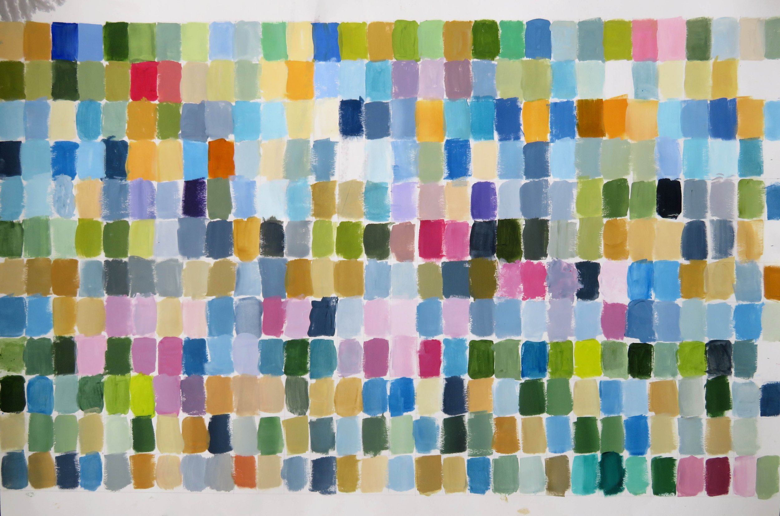
Back at the start of 2022 I had this bright idea to map my personal colour palette by keeping a chart of the colours I was using in my studio over a 12 month period. Here is a link to that post ….

Mapping Colour 2022

This idea came about after researching colour palettes and an artists reference to her personal colour palette …. which made me wonder what my personal colour palette might look like!

Now I know!

Here is my chart … it survived the chaos of the studio, although a little spilled ink on one corner mars it’s beauty!

While it doesn’t resemble any of the art I made during the year, I can see that these are my colours ….

Muted colours

Blues and greens and lots of variations in between - I’m definitely a cool person, even to the point that my choice of red is on the blue side!

The ochres and siennas that run through the chart along with the Payne’s grey, are earthy colours and provides a grounding for the palette.

There are plenty of light neutrals and tints .

If you look at some the art I made last year you can see that I love to work with …

-limited palettes

-both cool and warm variations of a colour

-increasingly with some strong contrast

-generally lean towards the use of lights and white to make for some luminosity


What can I learn from this and how can I push the boundaries?

I am thinking about extending my use of the colours within this palette, for example exploring different combinations of colours, exploring more tones and tints, more use of complimentary opposites and considering both saturated and muted colour …

I’d also like to see how my palette changes over time - so the plan is to keep mapping through 2023!

Thank you for reading, I appreciate your time.

With very best wishes for 2023 …. CC

Always


Hanging Art & Seasons Greetings ....

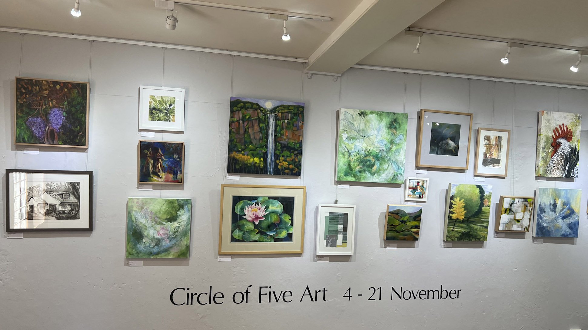
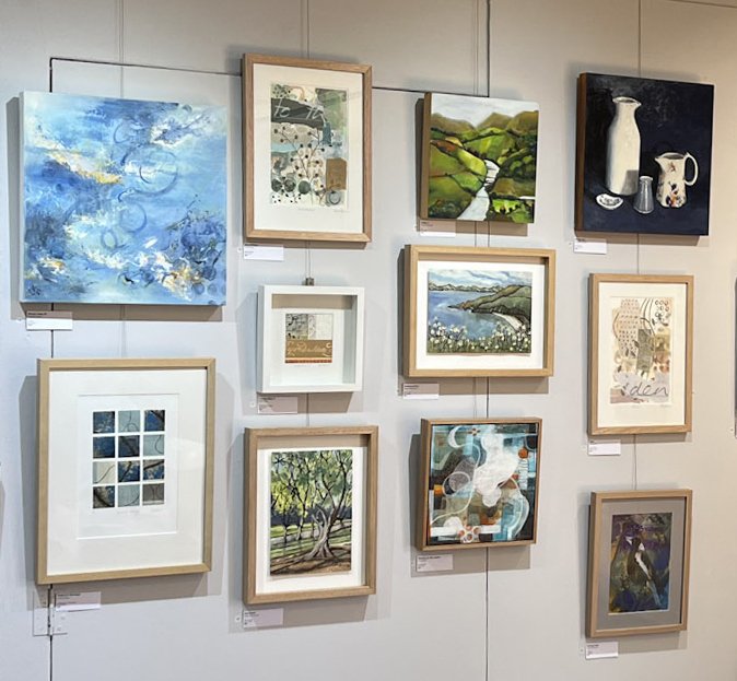
In November, ‘Circle of Five Art’ the exhibition group I am part of had its first exhibition at the Milk Factory Gallery Exhibition Space in Bowral.

Circle of Five is made up of 5 artists all with very diverse styles of work, so the big question in planning the exhibition was how to hang the work?

The aim of the exhibition was to introduce the group as well as the individual artists. There were a number of options; a section for each artist; a mixture of small groups of work or mix them up completely. This latter approach is the one we chose and is often referred to as a ‘salon’ hang.

It worked well with the diverse styles and the large proportion of smaller works. It is also an excellent option to consider for hanging art in your home!

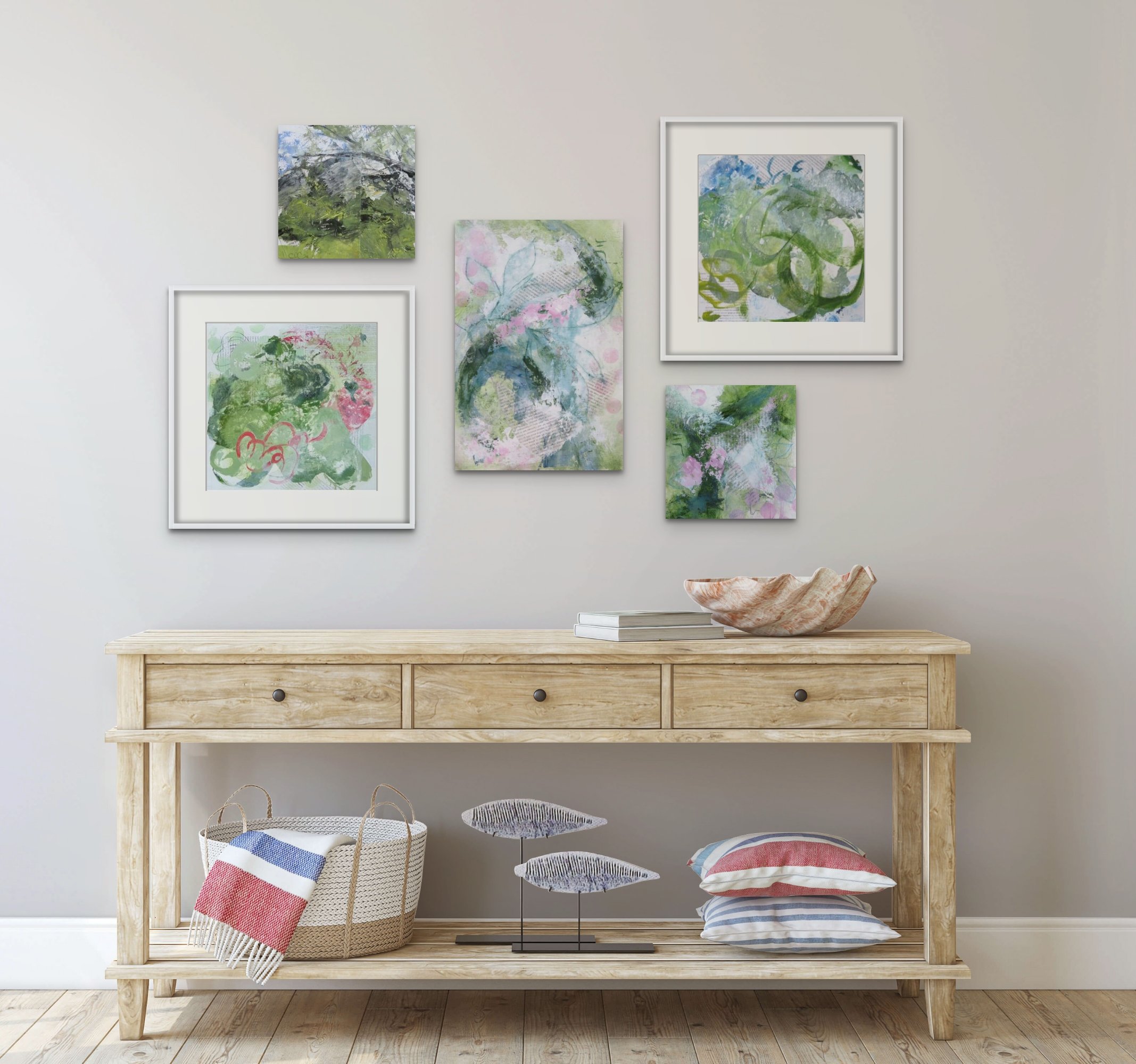
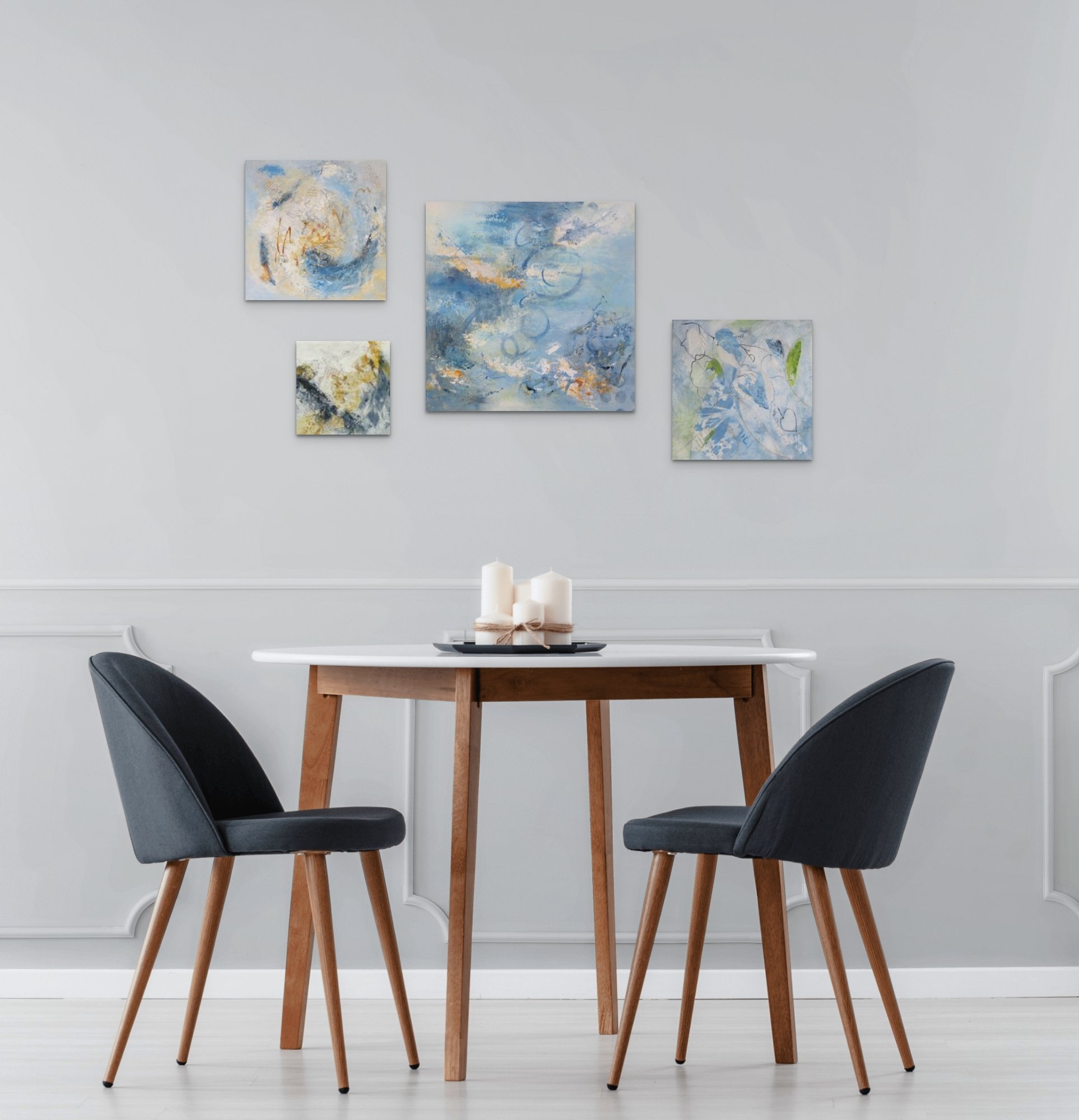
You can combine work you love, originals or prints or posters to create a unique wall of art. You can build on your collection over time as your budget allows. It is ideal for combining works of various sizes especially smaller works that can look lost on their own. ….

Here are some combinations that might inspire you to consider a salon hang and maybe adding to your collection …..


If you decide to venture down this path the the following tips might help….

Choose art you love in whatever form you can afford … it will reward you with joy many times over.

Mix it up … you can include original paintings, prints, sketches and other works on paper, photography, embroidery, maps … anything you enjoy looking at! Your Salon Hang wall can include a wide diversity of works just as our exhibition does.

Choose one or more larger pieces to anchor your hang. These are the most impactful pieces and it is good to choose their placement first - and then you can fill in around them.

Take your time …. start with a few pieces you love and add to it.

From a practical point of view … here is a link to a great article about how to get it right! and you will find many more on the internet …..

https://www.artshub.com.au/news/career-advice/how-to-get-a-salon-hang

As 2022 draws to a close I want to thank you for being here this year and taking the time to read my Art Journal and follow my art journey.

The move to exhibiting with Circle of Five Art has been an exciting step forward and will lead to many new opportunities in the years ahead!

I wish you all a safe, happy and peaceful Festive Season …. CC

Always


Lessons in Awe ...

I recently had reason to have an ultrasound of my heart - it’s all good! turns out my heart is working just as it should albeit a bit slower than others.

I have to tell you it was actually an amazing experience - watching and listening to my own heart in real time … mesmerizing and at times it made me catch my breath! I am truly grateful that it has kept working so well for all these decades!!!!

Lesson 1 - awe is within you and with you every day

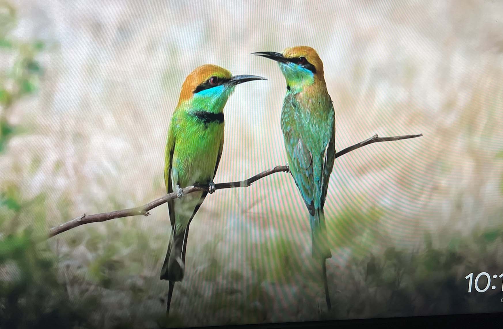
The second lesson came in the flash of a screen saver on the TV … a photo of two little birds with the most wonderful colouring! Rainbow Bee-eaters I think and quite breath taking! Nature can deliver awe in all shapes and sizes!

Then I came across an article by neuroscientist/journalist Richard Sima published in the Washington Post with the title “Why it is awesome that your brain can experience awe”

He describes awe as “a response to encountering something more vast, complex or mind-blowing than we had conceived of either physically or conceptually. The experience also induces a change in how we see the world, producing ‘little earthquakes in the mind’. …. Over the course of our lives our brain learns to encode what ‘normal’ is and predict what we think should happen next, based on our internal understanding of the world. That prediction of what happens next guides our behavior. It is crucial for being able to function in this incredibly complicated world. …. But it does narrow our perspective, it narrows our vision”

The article goes on to say that …

“Emerging research shows that experiencing awe may make us more curious, creative and compassionate people. …. By transforming our sense of self and meaning, and enhancing our relationship with others and the wider world, awe has the power to improve our mental and physical health.


So the next question is how to experience more awe!

Richard Sima suggests :-

  • viewing something giant ie a mountain range or ocean

  • discovering something tiny such as the worlds seen through a microscope

  • contemplating a piece of music or discovering a piece of art

  • taking ‘awe’ walks through your neighbourhood or nature …

So I’ve been thinking about awe and in particular the Rainbow Bee Eaters and have been playing with a new palette … just to see if I can capture a little of their magic!

and I am on the trail of experience more awe in my life! How about you?

Thank you for reading, I appreciate your time and interest in my art …. CC Always
Magnolias and New Work

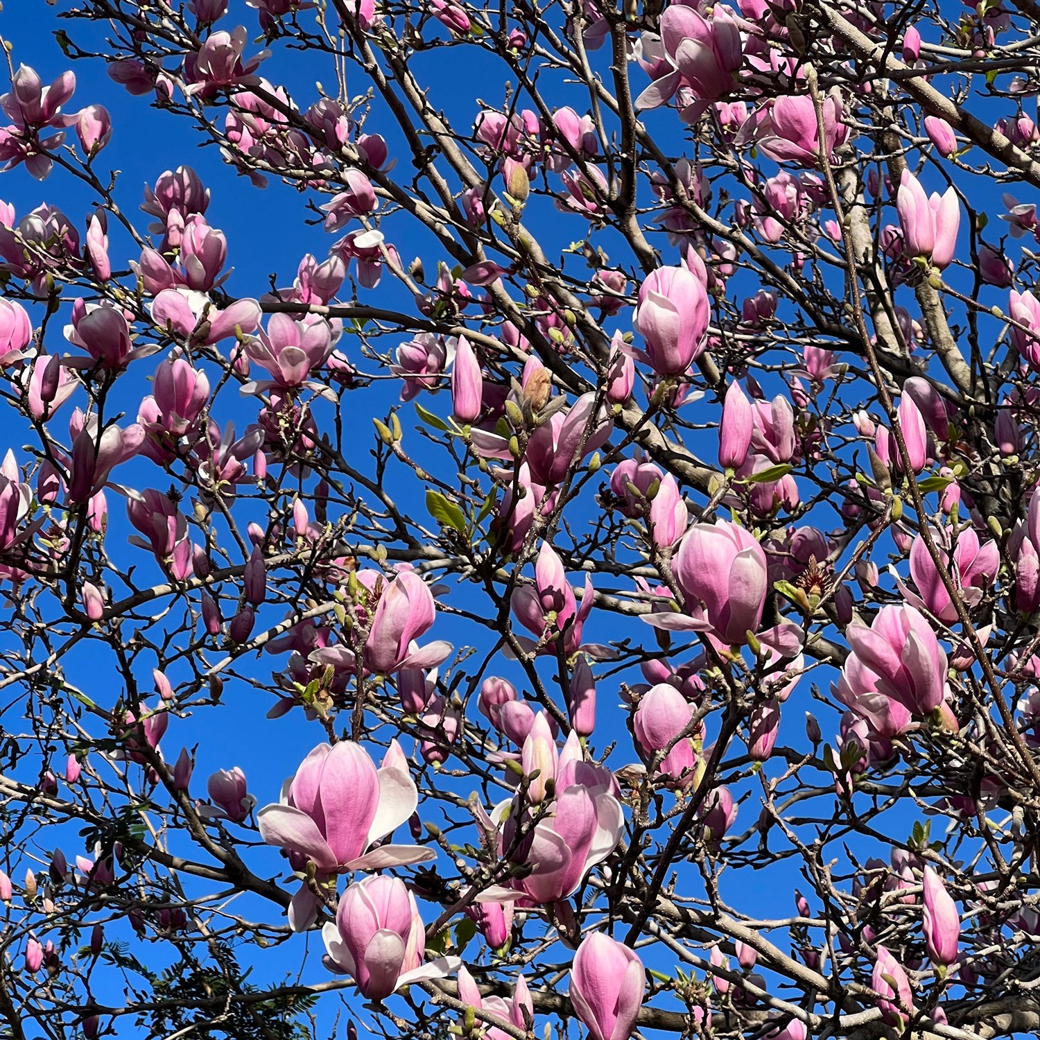
Late July/Early August is still quite cold here - well cold for Berry, and especially so this year … yet the garden is starting to stir and that sense of the seasons changing is tangible.

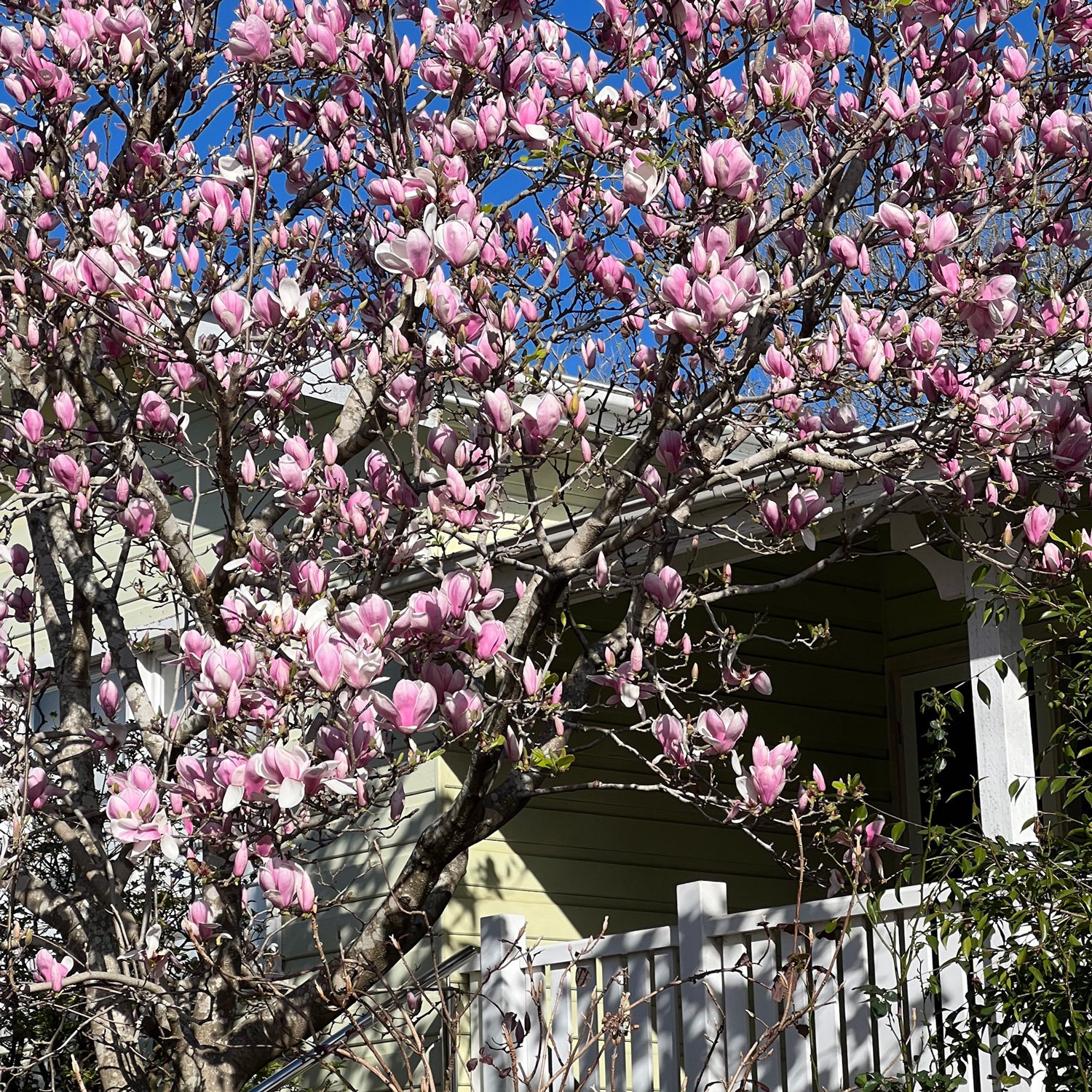
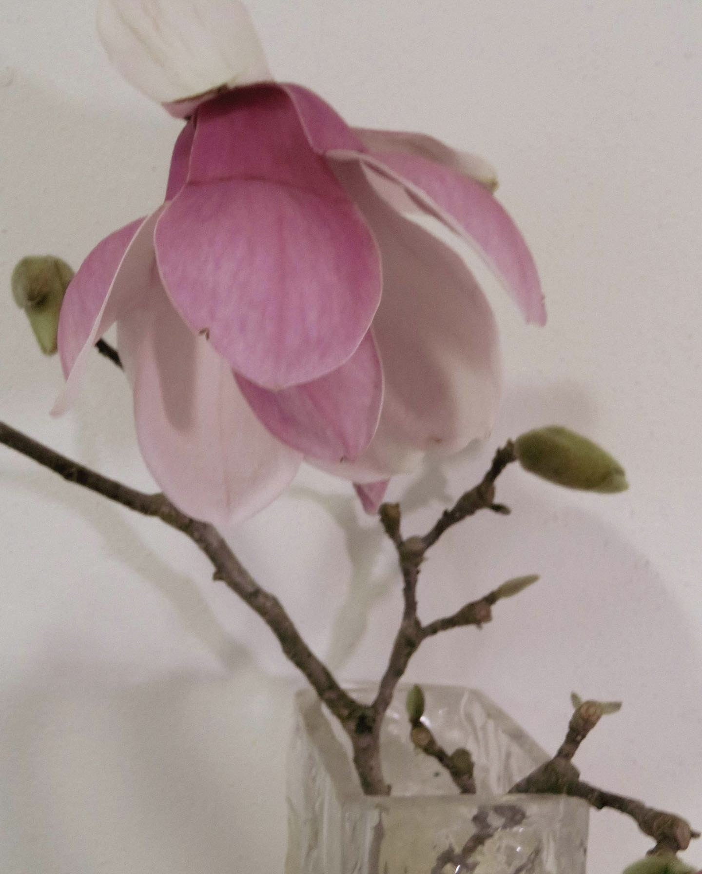
The days are lengthening and the fat buds of the Magnolia’s in my garden are opening with masses of pale pink flowers.

It’s not a long lasting display, especially if winds or rains arrive but it is spectacular … and it fills me with hope!

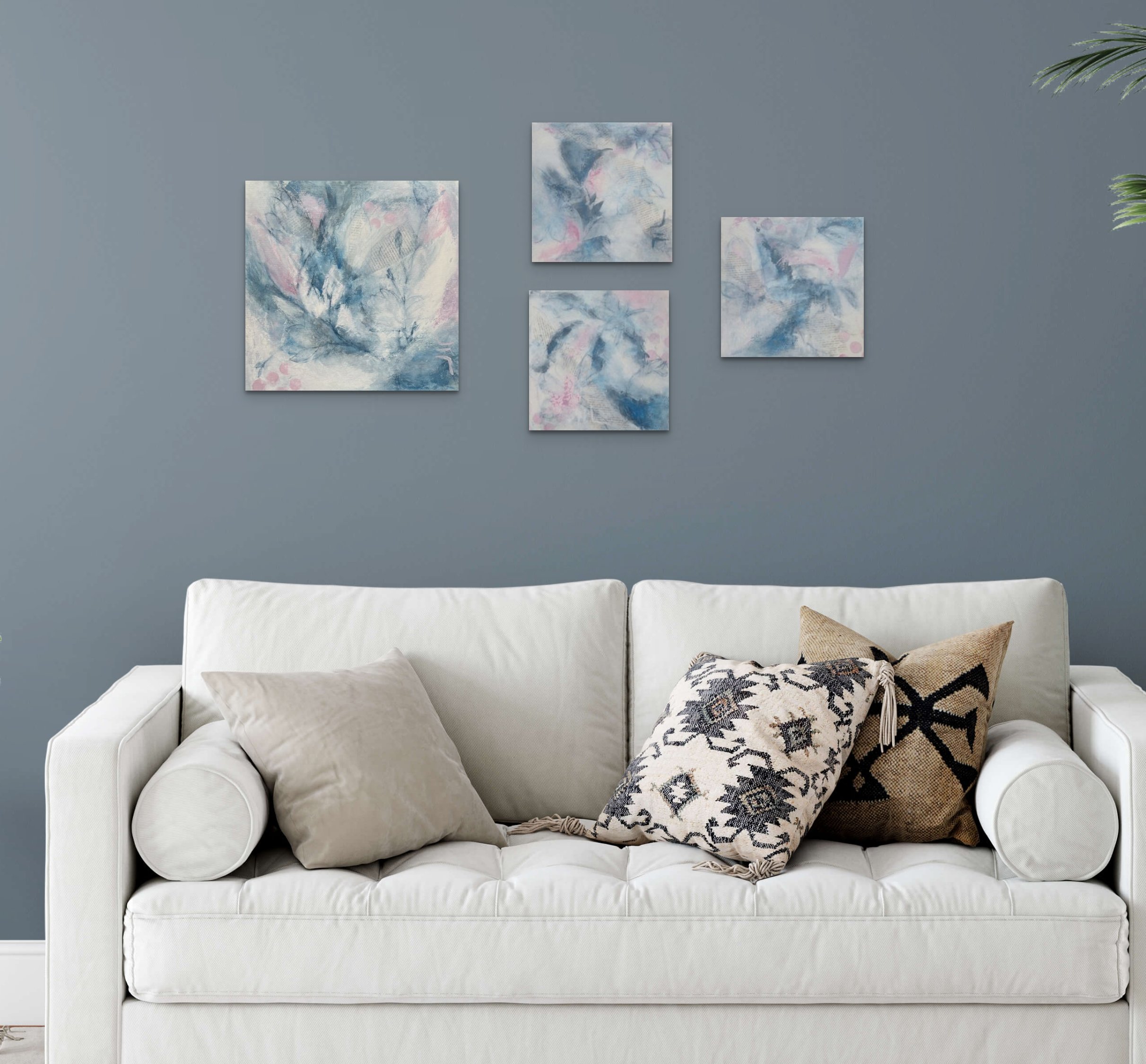
I am just starting on a new set of stretched canvases so how could I resist starting the canvases with Magnolia’s!

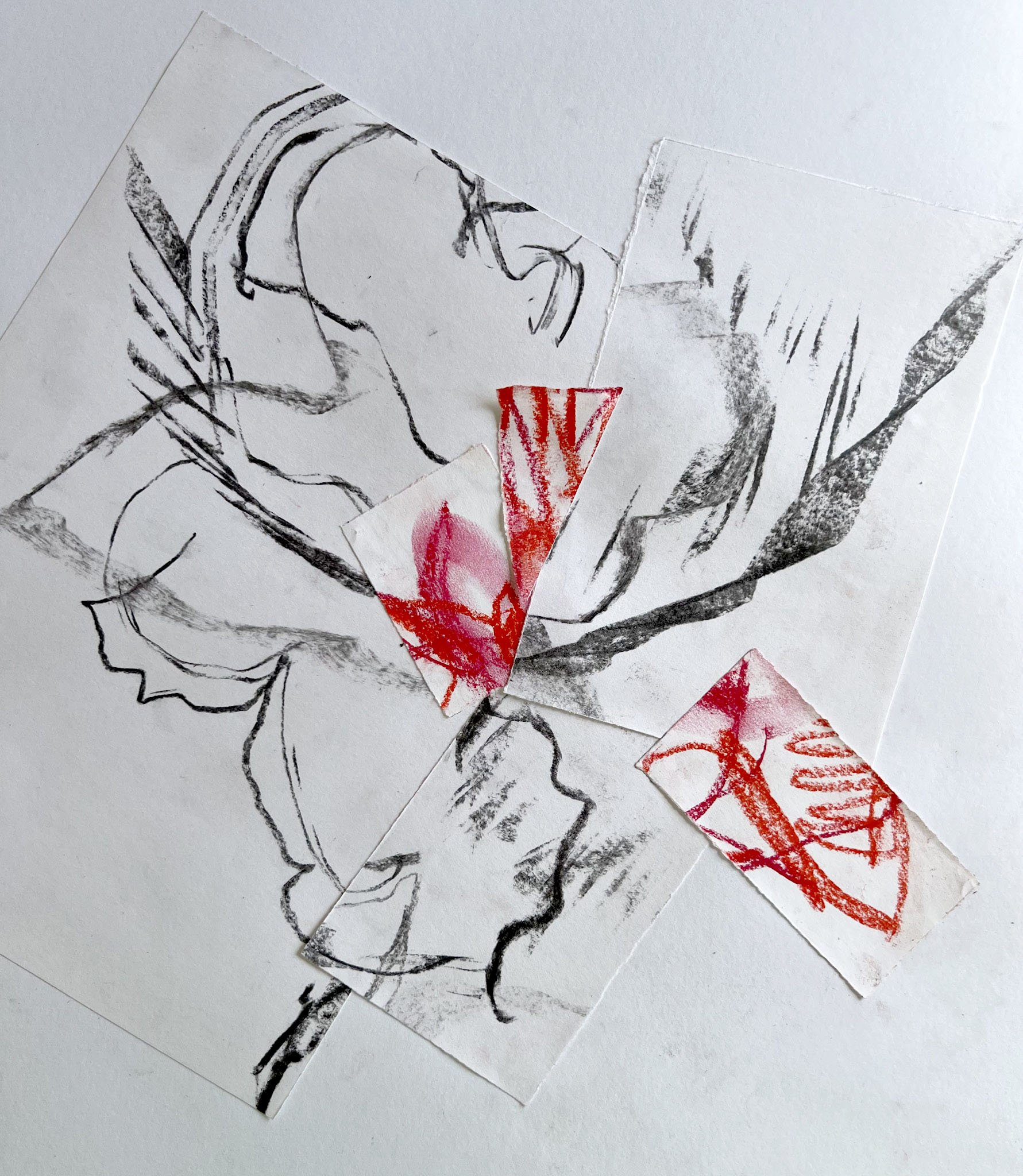
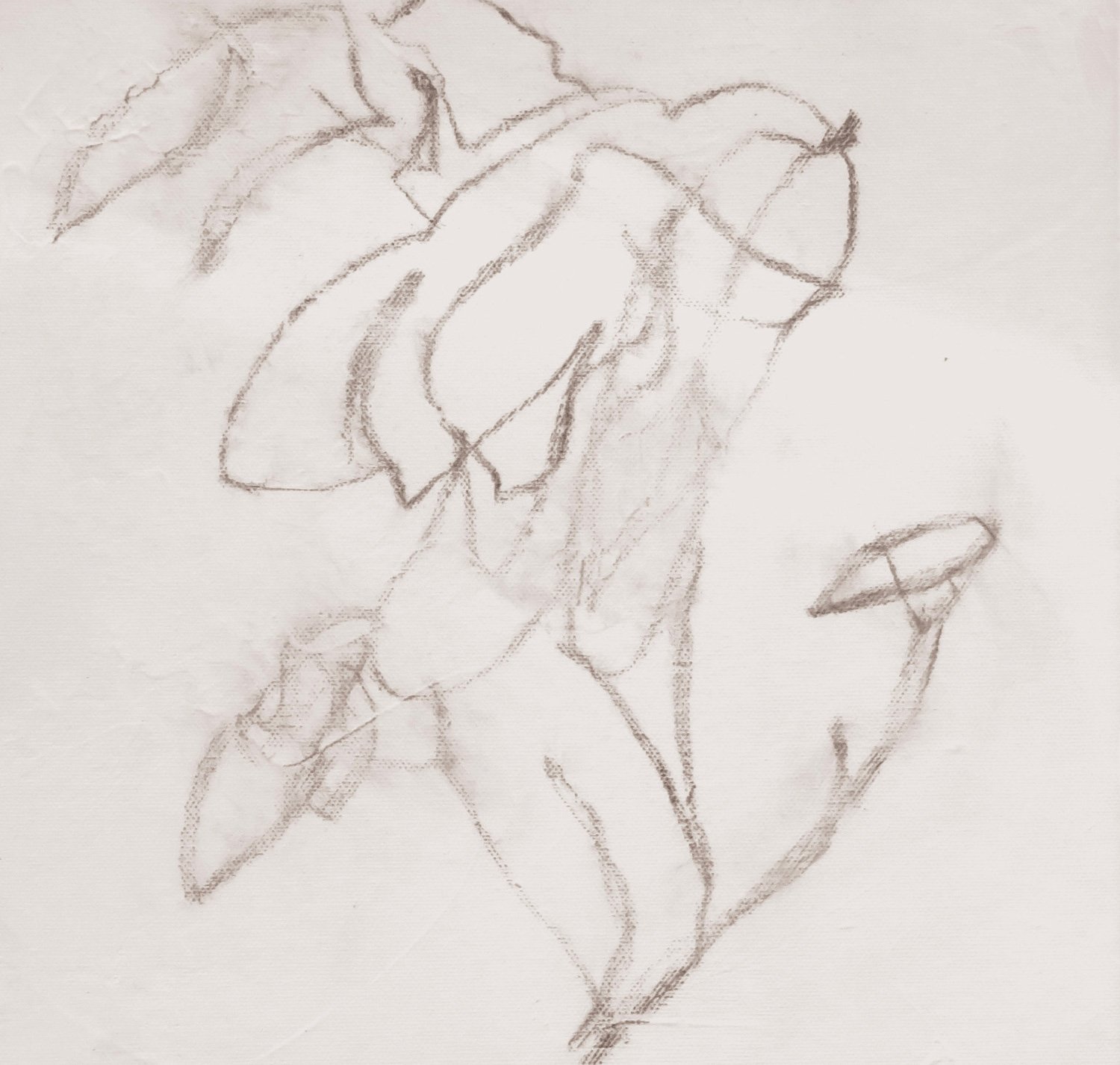
Some blind contour drawing (concentrating on the subject and not what is happening on the surface!) using charcoal and then a little of the dreamy pink! Most of this will be hidden as the work develops.

There will be more drawing at the later stages using water colour pencils.

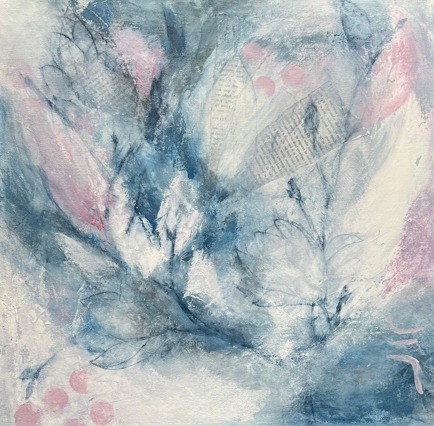
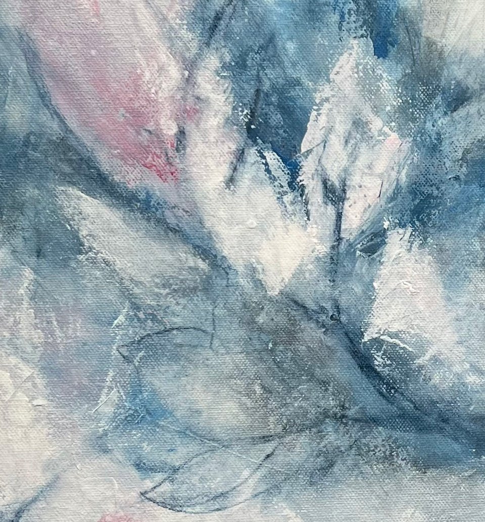
The finished works will be abstract but I hope they will feel like a late winters day with the warmth of the soft pinks, hinting at what is to come.

To help keep freshness in the work I have decided to limit the number of layers, it is so easy to think I’ll just add a little more pink here or change that shape a little which inevitably means that something else needs to change! …. this way I’ll stop and let it be …..

And that is where I’m at …. liking this piece and the direction of this work …. there will be more to come!

Thanks for reading, I appreciate your time and support ….. CC

Soft pink winter buds

Petals scattered by the wind

So it begins!

Always
Inspirations Revisited
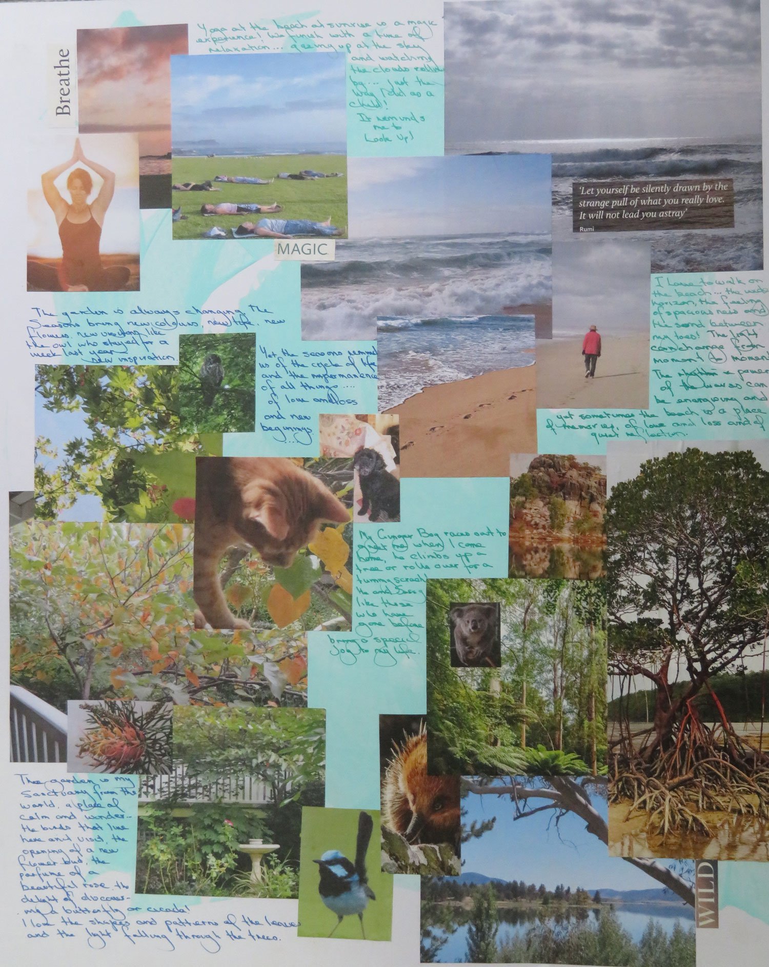
When I started CVP last year one of our first tasks was to create an inspiration board - it seemed a bit daunting at the time! In addition to gathering the visual content I also spent some time writing about those inspirations.

The board has hung on my studio wall since then and while the photo’s are a great reminder of what inspires me, it has been interesting to revisit what I wrote!

Now I look at it closely, the thing that really jumps out at me is this quote from Rumi ….

‘Let yourself be silently drawn by the strange pull of what you really love. It will not lead you astray’

Nick Wilton recommended we should review these inspiration boards on a regular basis so 12 months on seems like a good time!

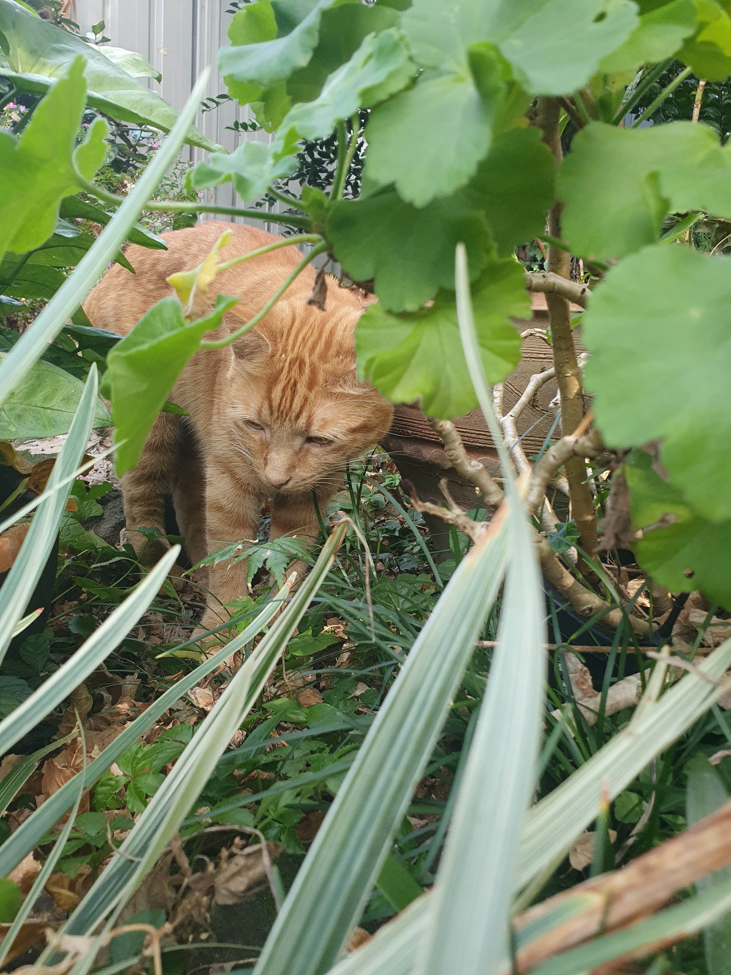
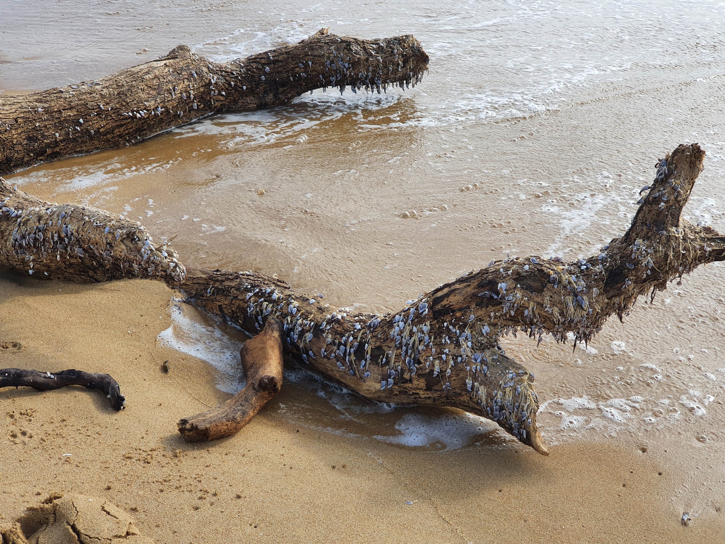
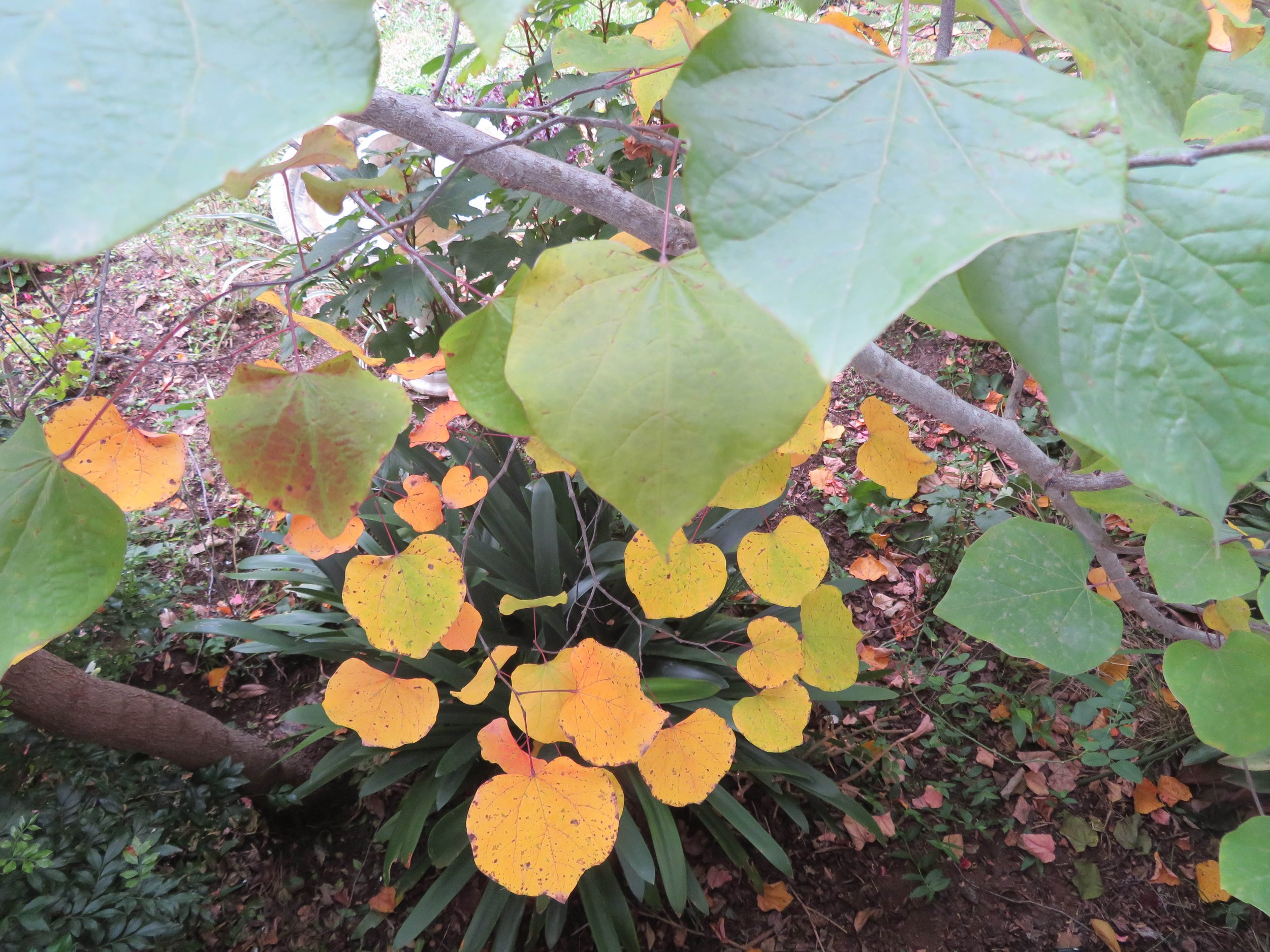
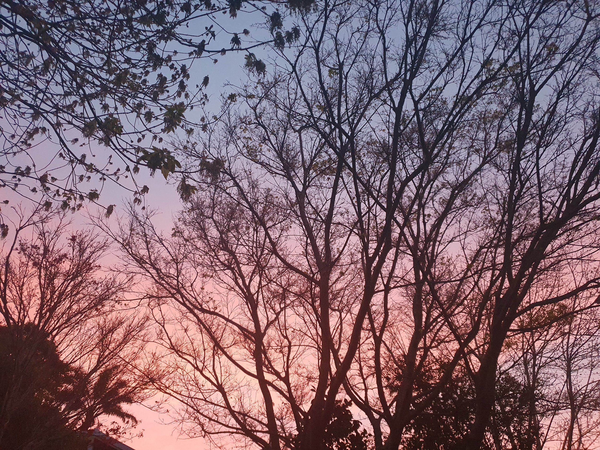
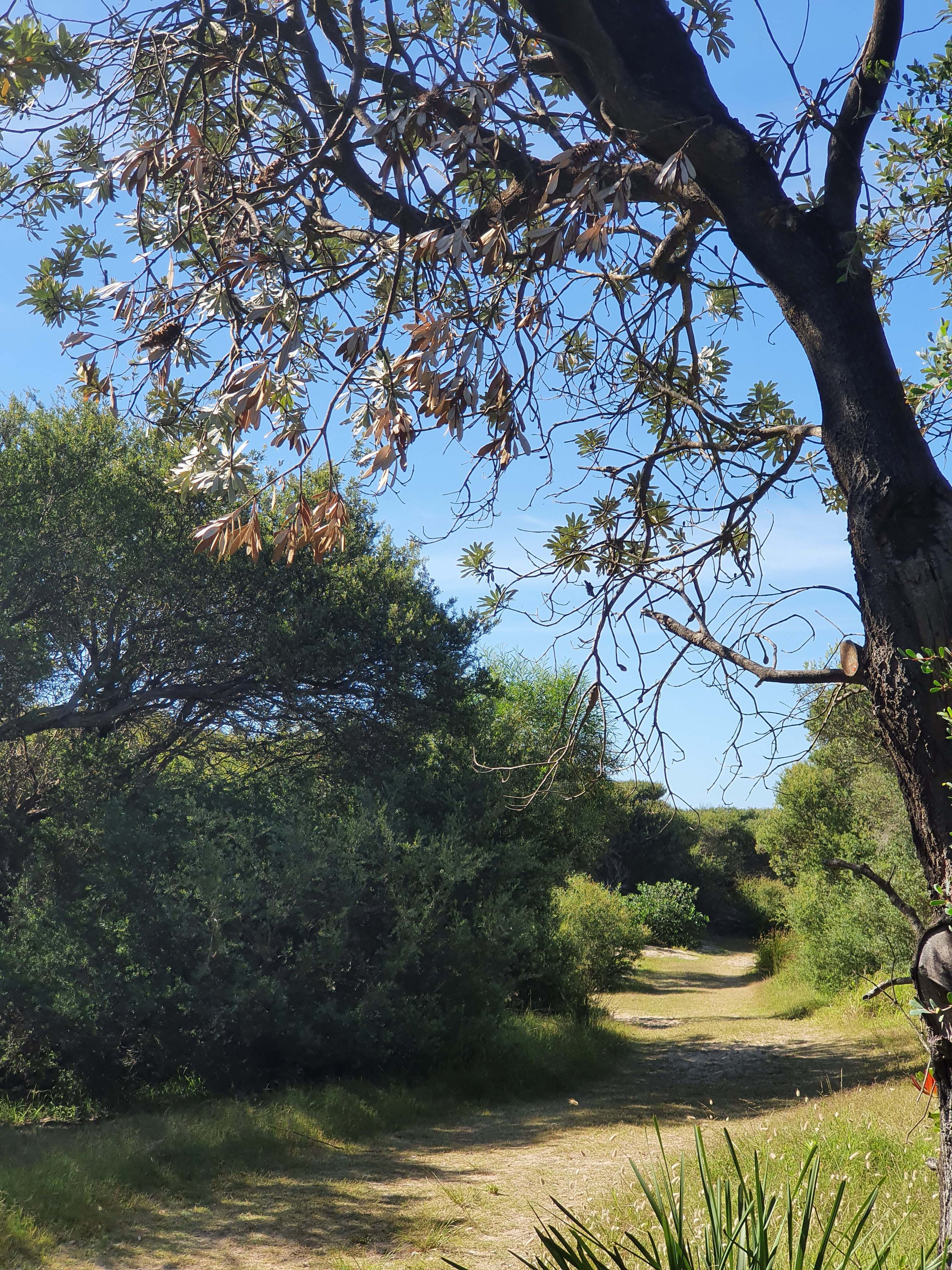
When I consider the images I selected for the original board and compare them with the images I have put together this week (see above) … the subject matter has not changed greatly but I can see that they are all located much closer to home … and also with a closer framing ie closer to the subject and not so much distant landscape - an impact of Covid perhaps? or being clearer about what it is that I love?

I can also see that in both sets of images there are a number of strong underlying themes ….

light shining through trees or clouds; sunrise and sunset; branching structures / V shapes in plants and leaves and patterns of leaves, flowers.

Now to see how these elements translate into abstract forms and composition ideas in my sketchbook!

Thank you for reading …. I appreciate you time and support. CC